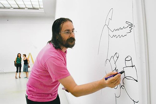
The cartoonist Seth, from an interview with Carousel in 2006:
“I have felt, for some time, a connection between comics and poetry. It’s an obvious connection to anyone who has ever sat down and tried to write a comic strip. I think the idea first occurred to me way back in the late 80’s when I was studying Charles Schulz’s Peanuts strips. It seemed so clear that his four-panel setup was just like reading a haiku; it had a specific rhythm to how he set up the panels and the dialogue. Three beats: doot doot doot— followed by an infinitesimal pause, and then the final beat: doot. Anyone can recognize this when reading a Peanuts strip. These strips have that sameness of rhythm that haikus have— the haikus mostly ending with a nature reference separated off in the final line.
As time passed I began to see this connection as more and more evident in how I went about writing my own work. Certainly, it is not a process that is very tightly worked out — but when I am writing a comics page (or sequence of pages) I am very aware of the sound and ‘feel’ of how the dialogue or narration is broken down for the panels. If you have to tell a certain amount of story in a page then you have to make decisions on how many panels you need to tell it. You need to arrange these panels — small, big or a combination of the two — and decide how to sit them on the page. All these decisions affect how the viewer reads the strip; there is an inherent rhythm created by how you set up the panels. Thin panel, thin panel, long panel: this rhythm is felt by the reader, especially when you put the words into the panels. When writing a comic strip I am very aware of how I am structuring the sentences: how many words; one sentence in this panel; two in this one; a silent panel; a single word. These choices are ultra-important in the creation of comics storytelling, and this unheard rhythm is the main concern for me
when I am working out a strip.I imagine poets feel this same concern. If you read any free verse poetry you can see how the poet has made certain decisions for how to break the thoughts apart and structure them, often in a way that defies a system.
[…]
It seems to me that the language of poetry is very dependant on setting up images and juxtaposing them against each other. A poet will create an image in the first two lines of his poem and then he will create another in the next two lines, and so on. I do find this jumping from image to image in poetry to be a very interesting, comic-like element. Many poems are almost like word comics.
Comics are often referred to in reference to film and prose — neither seems that appropriate to me. The poetry connection is more appropriate because of both the condensing of words and the emphasis on rhythm. Film and prose use these methods as well, but not in such a condensed and controlled manner. Comic book artists have for a long time connected themselves to film, but in doing so, have reduced their art to being merely a ‘storyboard’ approach.
The underlying rhythm seems to have gone unheard for literally decades in the world of commercial comic books (a few noticeable exceptions: Kurtzman, Kirby, Stanley).
[…]
The ‘words & pictures’ that make up the comics language are often described as prose and illustration combined. A bad metaphor: poetry and graphic design seems more apt. Poetry for the rhythm and condensing; graphic design because cartooning is more about moving shapes around — designing — then it is about drawing. Obviously when creating a strip about a man walking down the street you are drawing pictures of the man and the environment…however, you are also trying to simplify these drawings down into a series of more iconic, graphic renderings. The more detailed the drawing — the more it attempts to capture ‘reality’ — the more it slows down the story telling and deadens the cartoon language. Don’t get me wrong; the cartooning can be very specific, it doesn’t have to be generic. It simply has to properly ‘cartoon’ the images. The drawings become symbols that are arranged on the page (and within the panels) in the most logical way to make the reading of the story work; you place these cartooned images together in a way that does what you want them to do. You aren’t concerned with drawing a proper street scene so much as you are concerned with moving the reader’s eye around the page in the way you wish it to move. Trying to draw realistically just sets up a myriad of frustrations for the proper use of cartoon language. Think of the cartoon language as a series of characters (letters) being purposefully arranged to make words.”
Source: Ngui, Marc, “Poetry, Design and Comics: An Interview with Seth.” Carousel 19 (Spring-Summer 2006) [archived PDF]


