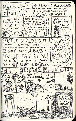
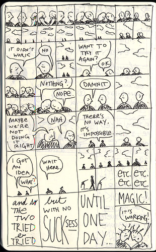
The drawing skills don’t matter. It’s can you get down on paper what’s in your head? And if you can in such a way that when I read it you’re opening up a new eye to the world for me or a new ear to the how people talk, or what have you…then it’s cookin’. It’s comics. And that’s all that matters.”
– Steve Bissette, from the really great little trailer for Tara Wray’s documentary, “Cartoon College”
FLANNERY O’CONNOR, CARTOONIST
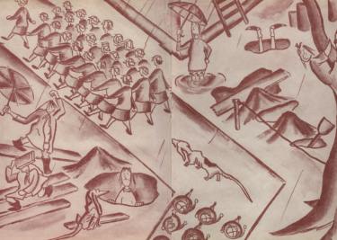
UPDATE 7/8/2011: Fantagraphics is putting out a collection of O’Connor’s cartoons, and I’ve archived a lot more here.
Few people know this, but Flannery O’Connor, one of my favorite writers, was also a cartoonist. She started out publishing cartoons in her high school and college newspapers, then tried to publish some in the New Yorker as a way to make money so that she could write her fiction. (That didn’t quite work out.) A few folks have noted that cartooning probably had some effect on writing her style: dig her grotesque caricatures and gift for combining the comic and the serious.
Here’s some more background from Georgia College’s Library Special Collections page for their Flannery O’Connor collection:
Flannery O’Connor’s first published works were her cartoons published in the Peabody Palladium, the student newspaper at O’Connor’s high school. According to the Palladium, by the end of 1941, O’Connor had written and illustrated three books about geese: Mistaken Identity, Elmo, and Gertrude, which O’Connor was unable to publish. The same article mentions Mary Flannery O’Connor’s school notebook, which was painted with oils and covered with cellophane. Around this same time O’Connor was also designing handmade lapel pins which were for sale at a local store in Milledgeville.
O’Connor’s career as a cartoonist continued at Georgia State College for Women when her cartoons began appearing as early as October 1942 in the college newspaper, the Colonnade. O’Connor’s cartoons depict humorous views of life on campus including , school performances, social activities, studying, and life on campus with the WAVES.
During her years at GSCW her cartoons appeared in almost every publication the college produced including the alumni magazine, the literary magazine, and on a weekly basis in the newspaper, the Colonnade. In 1944 O’Connor was appointed Art Editor of the college yearbook, the Spectrum, and designed numerous cartoons for the 1944-1945 yearbook, including the inside covers depicting campus scenes. In 1944 O’Connor also submitted cartoons to The New Yorker, but the magazine was not interested in publishing them.
Many of O’Connor’s published cartoons were linoleum-block prints. Linoleum-block printing involves cutting or etching an image on to a linoleum sheet. In O’Connor’s case, she attached the linoleum to a piece of wood, applied a solid color of ink to the linoleum cutting, and printed the image on to a piece of paper. The image was then printed in black and white in the final publication.
O’Connor’s interest in creating cartoons continued as she left home in 1945 to pursue a graduate degree in writing at The University of Iowa. Among O’Connor’s first courses at The University of Iowa were two courses in advanced drawing. She hoped to be able to support her writing by selling cartoons to national publications. O’Connor, however, was unable to sell any of her cartoons, at which time she began devoting all of her energy to writing.
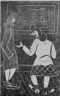
“I don’t enjoy looking at these old pictures either, but it doesn’t hurt my reputation for people to think I’m a lover of fine arts.”
A little bit more in depth, from Melissa Simpson’s Flannery O’Connor:
Her cartoons, which she did with a more conventional charcoal or ink and paper technique, instead of linocut, appeared in nearly every [Colonnade] issue while she was a student, beginning in October 1942, and were popular with students. They also frequently satirized the Women Accepted for Voluntary Service (WAVES), who were stationed at GSCW when the U.S. Navy designated the campus as a site for clerical training, for their nonconformity and their disruption of the male-female ratios in Milledgeville. O’Connor was also often critical of students and faculty for their apathy and of the educational establishment in general for its promulgation of weak-mindedness. O’Connor did not reserve her critical eye for everyone but herself, however. In several of her cartoons, she pokes fun at herself, as in the one which portrays a social situation in which everyone is dancing except for a “bespectacled wall flower who grins behind her hand and asserts that she can always pursue a Ph.D.”
Aspects of O’Connor’s personality and interests that find their way into her later writings are also evident in her early visual work. For example, her signature on the Colonnade cartoons consists of her initials, MFOC, formed into the shape of a bird, a childhood interest that she kept throughout her life. Like her fiction, her cartoons demonstrate her ability to illuminate the absurdities of social convention or of simple everyday life with a combination of seriousness and humor. While many of the instructors and administrators at GSCW appear to have looked at her cartooning with some disdain, O’Connor held a different opinion of the artistic medium. Even though she came from the area’s “aristocracy,” she despised pretentiousness and saw cartooning as just as valid as writing, charcoal sketching, or oil painting….Although several of her contemporaries expected her to find fame through her visual art, that focus eventually shifted to a near total focus on her written art; however, Robert Fitzgerald has noted that she admired the work of New Yorker cartoonist George Price a great deal, and of all the books in her personal library, only one is about art: a book on French artist Honore Daumier whose work helped shape the work of many cartoonists.
Jean W. Cash’s Flannery O’Connor: A Life goes into even more detail about her college days:
During her three years at GSCW O’Connor produced a linoleum block cartoon for each issue of the Colonnade….[asked] to describe how she “went about her work”…O’Connor explained that “first–she caught her ‘rabbit.’ In this case…the ‘rabbit’ was a good idea, which must tie up with some current event of a recent happening on campus…”
Unfortunately, the two images above are the only ones I could find on the net…if anybody has other links, I’d love to see them.
PUTTING THINGS INTO BOXES
My sketchbooks ebb and flow. Whenever I’m working non-stop on a project, my sketchbook suffers. Whenever I’m meandering, reading a lot, wondering what to do next, my sketchbook flourishes. Is there a correlation to my mental health? Almost certainly. Were food and shelter provided for me, I could be content to spend the rest of my days reading and doodling in a sketchbook, finished product be damned.
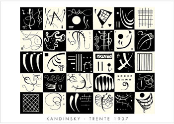
This afternoon I read Ivan Brunetti‘s interview in Todd Hignite’s IN THE STUDIO. He was talking a lot about grids, and how if you put objects into a grid, they read as a system, or “pleasing geometry,” and viewers automatically start to structure them and find relationships between them. He pointed to this Kandinsky print as an inspiration:
He also related this “putting things into boxes” as part of his definition of cartooning:
The nature of cartooning seems inherently playful, having its roots in a playful kind of drawing, but because you’re putting things into boxes and organizing pages into panels and shapes of rectangles and circles, it automatically has an architectural quality, too.
I was talking to Dan Chaon a while back and he told me he uses an exercise with his students where he has them divide a piece of notebook paper into six “panels” and then instructs them to write scenes in each box. I really like this idea of looking at writing as merely a filling of black space. Lately, I’ve been playing with grids in my sketchbook pages:
(I’ve also been copying people’s work: the last five panels are ripped from the amazing Tom Gauld.)
I find that gridding gives way to lots of spontaneous doodling and gaglines…
I’ve also been trying to rip off Lynda Barry and treat my writing as calligraphically as possible–varying text sizes and styles within the same space. Brunetti had a great point in the interview when he said that cartooning wasn’t necessarily drawing, it was more like calligraphy or writing…writing with pictures, as Saul Steinberg would say.
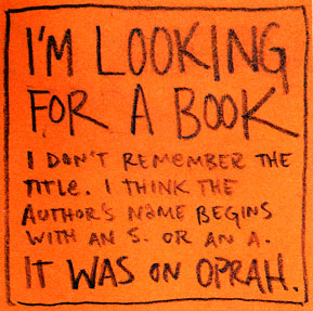
Speaking of putting things into boxes, I can’t really keep a sketchbook at my desk at work, but we have all kinds of post-it notes around, so if there’s a bit of downtime and a flash of inspiration, I’ve been using the post-it as a panel, and doing a quick doodle. Jessica Hagy’s wonderful index cards have already captured the cartoon-on-mundane-office-supply market…but Meg thought these were pretty funny:

THESE CODED DRAWINGS ARE REALLY MY JOURNALS
I have a confession to make. I haven’t been Working. I haven’t been Working, and I won’t be Working until sometime next year, when all this wedding craziness ends.
Does this bother me? Not as much as it should.
Actually, things have been quite pleasant. Minus the wedding anxiety dreams. Last night I had a dream that I overslept until five minutes before the ceremony, and my shirt wasn’t ironed, and I tripped over the power cord and severely burned my forearm, but instead of calling 9-11, I called my mom to make sure she stalled everybody until I could get there…
Now, I should be drawing this. I should be making cartoons of this.
But I don’t have a deadline to make. Thank you, baby Jesus.
There is an excellent Washington Post article today about the editorial process of selecting cartoons for the New Yorker and the new book, Rejection Collection: Cartoons You Never Saw and Will Never See In The New Yorker. In case you didn’t already now, even if you get a contract as a New Yorker cartoonist, your rejection rate on a good week is 80 or 90 percent — every week, New Yorker cartoonists send in 10 or more drawings, and at the very best, the editors pick one or two, at the very worst, they reject them all.
It’s tough being a cartoonist.
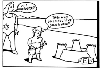
But there are a few perks. This is from the introduction to Bruce Eric Kaplan’s collection, This Is A Bad Time:
…these drawings are really my journals. I use them to explore whatever I find interesting, confusing, or upsetting on any given day. But here’s the beauty part—these private thoughts are filtered through the prism of moody children and blasé pets, disillusioned middle-aged men and weary matrons, among others. And so I get to work through whatever I am thinking about in a coded way. No one but me will ever know what the real seed of each image and caption was. So I can be as free as I want to say whatever I want, and no one can catch me. It’s great.
A FEW THOUGHTS ON PEANUTS
I’ve been on another obsessive Peanuts-reading tear. If you’re interested in listening in to the conversations of one of the greatest geniuses of the 20th century, I highly recommend Charles M. Schulz: Conversations. Particularly wonderful is the 100+ page interview with Gary Groth from 1997 that ran in the Comics Journal.
Two things that strike me right this second about the strip.
First, I’ve been thinking about the difference between reading comics in serialized form — in newspapers or seperately published editions over time — and reading them in book form. Schultz himself said that comics strips weren’t art because they were “too transient” to appeal to several generations. But the act of collecting Peanuts into books, or “treasuries,” basically has cemented their status as great art. Because the characters are so strong, and the world is so static over time, Peanuts is an epic of gag strips — in book form, it really does amount to what George Saunders called a “50-year novel.”
Second, I’ve been thinking about the way in which Schultz’s drawing led his ideas. His formal innovations with his drawing — dressing Snoopy up as a fighter pilot, for instance — led to his character and story development.
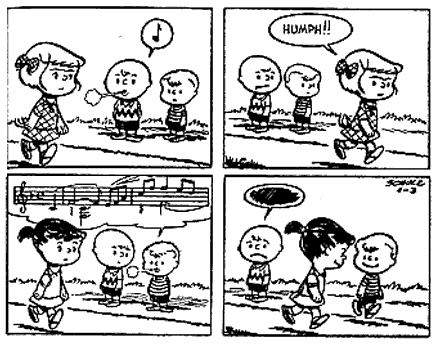
Take the character of Schroeder. Schultz said:
“I was looking through this book on music, and it showed a portion of Beethoven’s Ninth in it, so I drew a cartoon of Charlie Brown singing this. I thought it looked kind of neat, showing these complicated notes coming out of the mouth of this comic-strip character, and I thought about it some more, and then I thought, ‘Why not have one of the little kids play a toy piano?'” (*)
Schultz made sure to recreate exactly those Beethoven musical scores by hand, and it was the act of drawing — the simple aesthetic pleasure of musical notes in a comic strip — that led to Schroeder.
What this means to me is that drawing comics is its own particular brand of alchemy. You can’t just sit down and say, “I’m going to draw a character with a funny nose who has no father and always trips over his shoelaces.” The description means nothing. You have to draw that character into existance.
It’s the act, not the idea.
