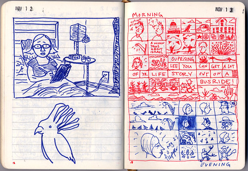
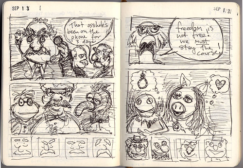
I don’t crosshatch. I don’t like to put a line through another line.
— Tony Millionaire
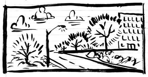
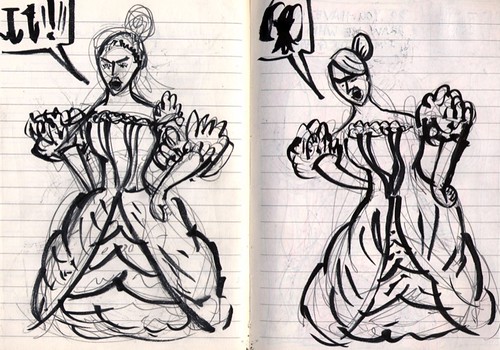
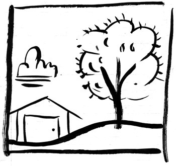
Doodling a lot with my sumi-e brush:
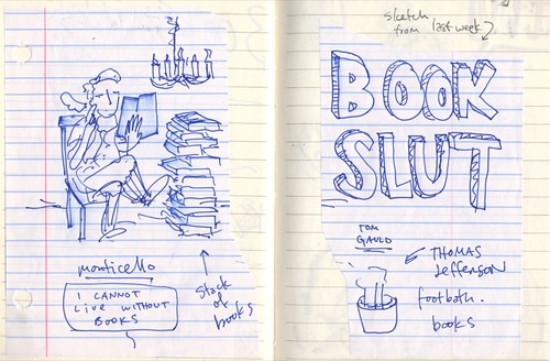
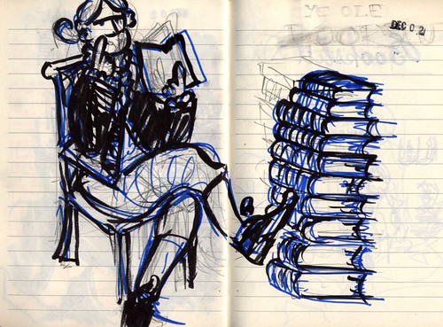
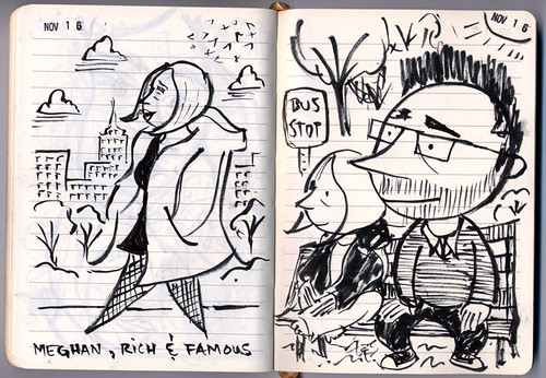
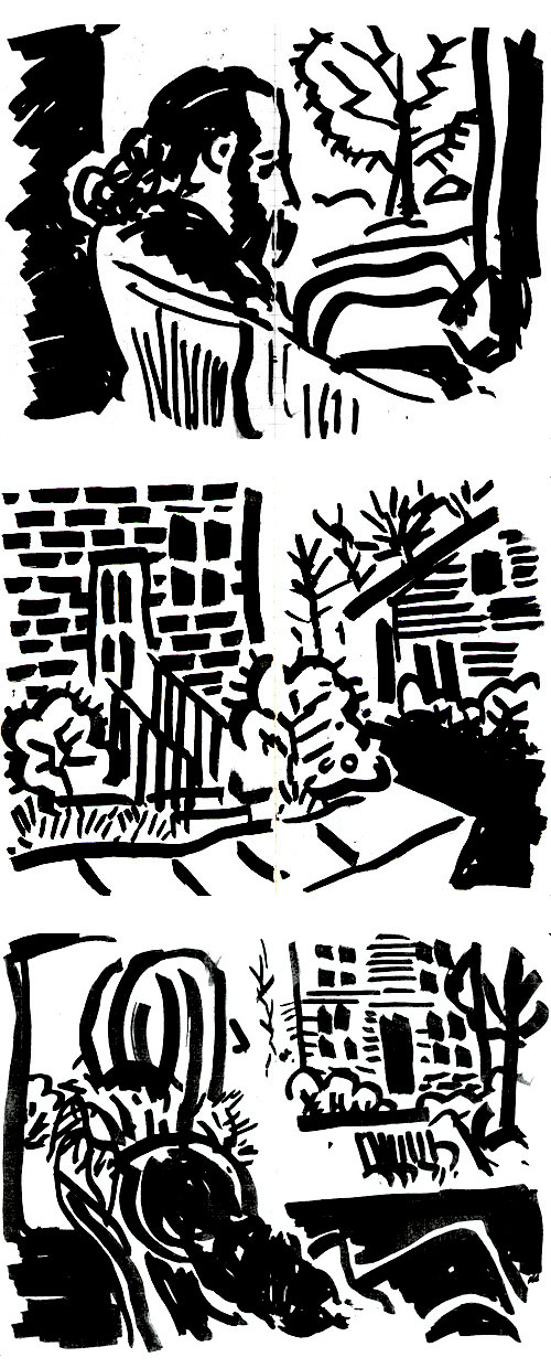
And drawing on the bus with a big, fat chisel-tip marker (keeps you from being too precious with your line):
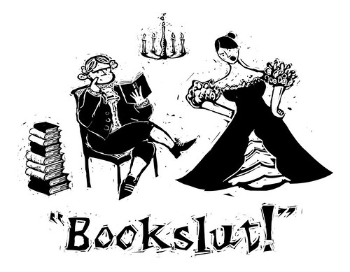
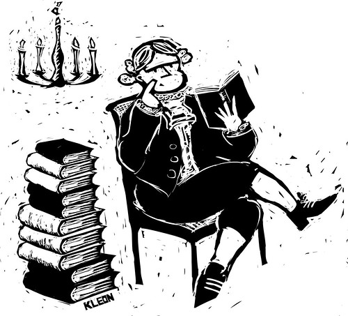
As a woodcut artist, I’ve always been attracted to black-and-white art. I think it has something to do with the rich contrasts. I love a deep rich black that you can stare into, forever. The effect is like our colorful world torn down to its base so that we can read the unerlying message. The truth is always easier to take in black and white. Typography is always more legible in black and white, so why would we be surprised to find the readability of artworks enhanced by those contrasts? Remove the grays and hues, reduce the image to lines and solid blacks, and open up the whites. You have a thing of beauty and simplicity.
Another way to understand our attraction to black and white is through the science of how we see. The human eye consists of rods and cones that process the reflected light of our world. These signals are then translated into color and form for processing by our brain. The rods, which are sensitive only to black and white, are the first components activated in a baby’s eyes. That’s why infants readily respond to high-contrast black-and-white images. We are hardwired to appreciate black-and-white artwork.
—George A. Walker, preface to Graphic Witness
