All memory has to be reimagined. For we have in our memories micro-films that can only be read if they are lighted by the bright light of the imagination.
— Gaston Bachelard, The Poetics Of Space
Something weird happens when we try to recreate cultural artifacts from memory: the result has less to do with the artifact, and more to do with us.
A year or two ago I got a Bonnie Raitt song stuck in my head. “I Can’t Make You Love Me.” I had the day off and I was bored, so I decided to sit down with my guitar and try to record the song from memory. I didn’t want to bother learning the lyrics or listen to the original. I just wanted to roll tape and see what happened.
On playback, it was the same song, but it wasn’t. The chords were “off,” and I’m pretty sure I left out a bridge. It’s like the filter of my memory took out the musical complexity and stripped it down to its bones. Left only a “cartoon” of the song…
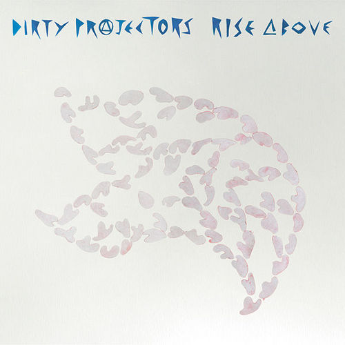
Here’s the story behind the amazing Dirty Projectors album, Rise Above:
[Dirty Projectors man man Dave] Longstreth went to help his parents move out of the house he grew up in. Among his youthful artifacts was the cassette case from the Black Flag album Damaged. This brought back all sorts of memories— Black Flag was one of Longstreth’s first loves— but the tape itself was missing. So, like the character in the Jorge Luis Borges story ‘Pierre Menard, Author of the Quixote’ who sets out to recreate Don Quixote line by line from memory, Longstreth went to the nearest Guitar Center, purchased the cheapest cassette four-track he could find, and embarked on recasting Damaged from memory, without re-listening to a single note or reading any lyrics. The ten songs that make up Rise Above (titled after one of the tracks on Damaged) stem from these four-track demos, recorded at his parents’ house on an acoustic guitar.
“I had to completely inhabit my early adolescence, the time when I used to listen to Damaged,” Longstreth has said. “[I was] trying to access the memory crystals stored from when I loved it back in middle school.”
The beauty of Rise Above is that Longstreth used his memory of the original Black Flag songs as a starting point to create “new” songs. “I wanted to see if I could make this album…not as an album of covers or an homage per se, but as an original creative act.” It was his imagination that made them great.
It frees us to have constraints. I’m starting to believe that the idea that the artist can should sit down and create something “new” is a paralyzing delusion. We can only create a collage of our influences, our memories—filtered through our imagination.
By re-interpreting these artifacts, we come up with something that is uniquely our own.
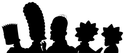
Ivan Brunetti has a drawing exercise (link long dead — try his excellent book, Cartooning: Philosophy and Practice) where he has his students doodle cartoon characters quickly, from memory:
When drawing characters quickly, from memory, one can be quite inaccurate, almost as if one is inventing new characters, and these “mistakes” can serve as the basis for new character designs. This lets the students see their own styles more clearly. A page full of these doodles can help the student discern certain qualities that are consistent within their set of drawings. These qualities are a clue as to what makes one’s particular “visual handwriting” different or unique, and these should be embraced by the student.
The idea that by drawing from memory “copies” of other work, we can somehow sharpen our own sense of what makes us unique! I love it.
Links:
