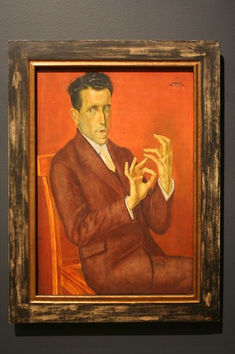
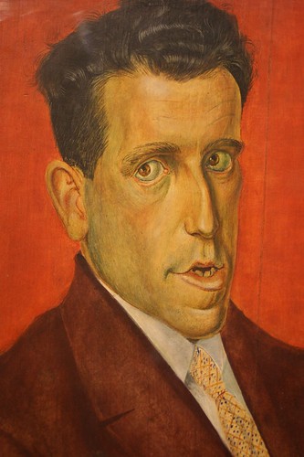
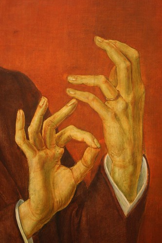
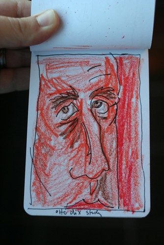
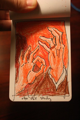
This 1929 portrait is the best thing hanging in the Montreal Fine Arts Museum. Absolutely stunning.
More on Otto Dix, who was part of the amazing Glitter and Doom show we saw on our honeymoon.
This 1929 portrait is the best thing hanging in the Montreal Fine Arts Museum. Absolutely stunning.
More on Otto Dix, who was part of the amazing Glitter and Doom show we saw on our honeymoon.
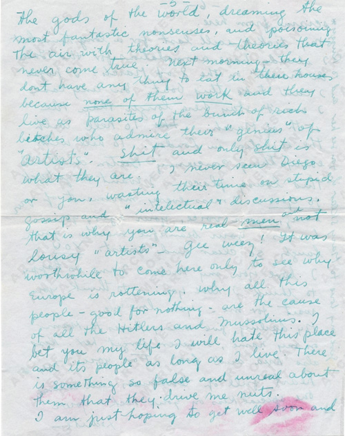
In some recent reading I ran across this hilarious passage written by Frida Kahlo to her long-time affair and lover, the photographer Nickolas Muray. In 1939, Kahlo was in Paris trying to get a show when she got sick and had no help from André Breton. She was rescued by Marcel Duchamp, who she called “a marvelous painter…who is the only one who has his feet on the earch among all this bunch of coocoo lunatic sons of bitches of the surrealists.” She goes on:
I have decided to send every thing to hell, and scram from this rotten Paris before I get nuts myself. You have no idea the kind of bitches these people are. They make me vomit. They are so damn “intelectual” and rotten that I can’t stand them any more. It is realy too much for my character. I rather sit on the floor in the market of Toluca and sell tortillas than to have anything to do with those “artistic” bitches of Paris. They sit for hours on the “cafes” warming their precious behinds, and talk without stopping about “culture” “art” “revolution” and so on and so forth, thinking themselves the gods of the world, dreaming the most fantastic nonsenses, and poisoning the air with theories and theories that never come true. Next morning, they dont have anything to eat in their houses because none of them work and they live as parasites of the bunch of rich bitches who admire their “genius” of “artists”. Shit and only shit is what they are. I never seen Diego or you, wasting their time on stupid gossip and “intelectual” discussions. that is why you are real men and not lousy “artists”. Gee weez!
Sound like anyone you know?
Read more:
Yesterday I read this little paragraph in Roger Ebert’s response to claims that he gives out too many stars:
The only rating system that makes any sense is the Little Man of the San Franciscio Chronicle, who is seen (1) jumping out of his seat and applauding wildly; (2) sitting up happily and applauding; (3) sitting attentively; (4) asleep in his seat; or (5) gone from his seat….The blessing of the Little Man system is that it offers a true middle position, like three on a five-star scale.
So I did a little research. The Little Man was the creation of Chronicle artist Warren Goodrich in the early 40s:
On the occasion of the Little Man’s 50th birthday, Goodrich recalled it was just another assignment that he dashed off quickly, noting, “I’m surprised (it) continued.”…Goodrich, who died last year, once recalled that a woman (possibly a disgruntled actress) once hit him on the head with her umbrella and said, “I hate the Little Man!”
The woman isn’t alone. Many of the writers at the Chronicle hate The Little Man. They boo-hoo that the picture already tells the story!
The beloved icon of this newspaper’s entertainment sections is, in fact, a complete nuisance to criticism….That’s because the Little Man gives you a visual clue to what you’re about to read.
And they complain about what Ebert loves: the middle man on the scale—the man with ambiguous feelings.
[T]he message is often unclear…when he’s merely sitting in his chair, watching. Not clapping. Not jumping out of his seat and clapping. Not slumped in his seat. Not out of his seat. Just sitting there.
I suppose a comment could be made here about how people can’t handle ambiguity in their lives: they want things to be black and white, with no shades of grey. As Ebert quotes Siskel,
“What’s the first thing people ask you? Should I see this movie? They don’t want a speech on the director’s career. Thumbs up–yes. Thumbs down–no.”
In fact, the editorial staff was so bothered by the neutral middle man that they had him redesigned:
Few are aware that the L.M. was retrofitted about 10 years ago with a more benign expression. The Little Man pose in between the politely applauding and the snoozing Little Man was redesigned in a microscopic makeover: the “alert viewer” Little Man’s expressionless mouth was tweaked with a slight upturned curve, to indicate a hint of a Mona Lisa smile, suggesting a vague amusement. His raised eyebrows indicate interest but not quite approval, denoting mixed feelings. After artistic spinal fusion, he also sat up more alertly, signifying a mixed review.
All of this came after Talmudic editorial discussions about the meaning of the enigmatic No. 3 Little Man: Did his indecipherable gaze indicate intrigue or ennui? Polite diffidence or glazed-eyed apathy? As a Datebook editor noted, “He’s the middle child, and the most unmanageable.”
I say: 3 on a 1 out of 5 scale should be ambiguous and neutral. Instead, he’s upright as if he’s engaged and smiling, as if he’s liking it. His back should be against the chair:
And to be totally ambiguous, his mouth should be a straight line (or no line at all), with no eyebrows. A blank face:
An ambiguous visual calls for explanatory text! And so, the neutral man is a friend to the good critic: if the visual is ambiguous, then the reader should be more tempted to investigate the article text to get the writer’s take!
Note: this was a repost from my tumblelog. Apologies for doubling up.
Yesterday, I was thinking about telling a story in pictures without words, and so today, in the aftermath of all the Sarah Palin pregnancy conspiracy theory madness, I started thinking about telling a story with words added to pictures.
The documentary filmmaker Errol Morris had it nailed in his NYTimes article, “Photography As A Weapon,” about photoshopping, forgeries, image processing, captions (and John Heartfield and King Geedorah!):
Doctored photographs are the least of our worries. If you want to trick someone with a photograph, there are lots of easy ways to do it. You don’t need Photoshop. You don’t need sophisticated digital photo-manipulation. You don’t need a computer. All you need to do is change the caption.
I don’t know what these buildings were really used for. I don’t know whether they were used for chemical weapons at one time, and then transformed into something relatively innocuous, in order to hide the reality of what was going on from weapons inspectors. But I do know that the yellow captions influence how we see the pictures. “Chemical Munitions Bunker” is different from “Empty Warehouse” which is different from “International House of Pancakes.” The image remains the same but we see it differently.
Change the yellow labels, change the caption and you change the meaning of the photographs. You don’t need Photoshop. That’s the disturbing part. Captions do the heavy lifting as far as deception is concerned.
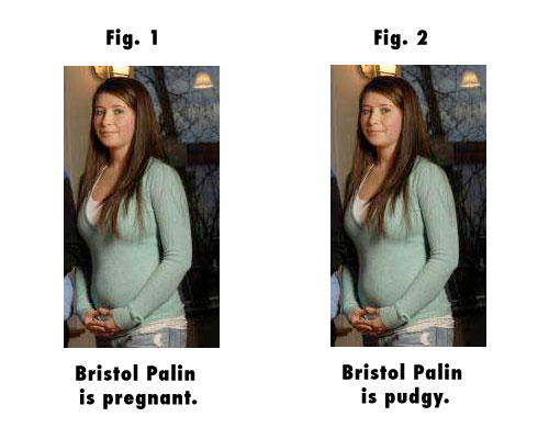
If you read through this Daily Kos piece, the writer presents pictures of Palin at various stages of her pregnancy looking thin and trim as “evidence” that she wasn’t really pregnant with her fifth child, but it was her daughter, Bristol, who was pregnant. The article is simply a list of photographs with captions—and the captions control how we read the photographs.
Many folks pointed to this picture as evidence of a Bristol Palin “baby bump”:
A picture which would otherwise be an innocuous portrait of a nice-looking family is turned into a sinister conspiracy by the words, or caption, adjacent to it.
The moral of the story is that pictures can say whatever we want them to say, provided we use the right words.
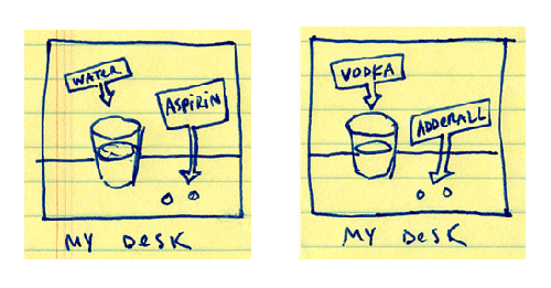
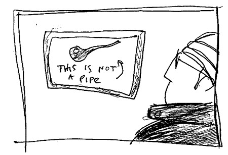
The power of captions can be used for good, or it can be used for evil. For a cartoonist, it’s a potent weapon, which can take any drawing and turn it in many different ways. Take this hasty doodle:
Depending on which captions I use, you’ll get a different picture of who I am, yes? In comics, it seems, the old creative writing adage “show don’t tell” is useless—you can certainly tell as much as you show, show what you tell, or tell what you show.
I’d love to hear your own thoughts on the use of captions in the comments below. I also recommend taking a look at Derik Badman‘s article, “Text In Comics.”
A story is told in images.
You can do it with words, you can do it with pictures, or you can do it with both.
For those interested in doing it just with pictures, there are two books in print right now on woodcut novels and wordless books that are absolute must-reads. First, for an overall sampler and history of the form, get David Beronä‘s Wordless Books: The Original Graphic Novels. Beronä is the Library Director of the Lamson Library at Plymouth State University, and he’s been researching woodcut novels and wordless books for twenty years.
Beronä begins with the granddaddy of it all and my personal favorite, woodcut artist Frans Masereel, and points out three major elements that were in the air when Masereel started to create his works:
1) the revival of the woodcut, mostly thanks to the German Expressionists
2) silent cinema, and a “public already familiar with black-and-white pictures that told a story”
3) newspaper cartoons
Beronä goes on to trace the development of the form, including some of my other favorites: the woodcut novels of Lynd Ward (whose name spelled backwards is “draw”) and Otto Nuckel, Milt Gross’s cartoon novel He Done Her Wrong, and Istvan Szegedi Szuts’ ink + brush piece My War.
In the book’s introduction, the the fantastic cartoonist and scratchboard genius Peter Kuper mentions the biblical story of the Tower of Babel and locates wordless woodcut stories as part of humanity’s ongoing quest to use images and symbols to “sidestep our language barriers and create…stories that can be universally understood.”
“Looking for similarities among these artists you find that many share a contrasting use of black and white, dark and light, with a dash of yin and yang. Most also share a connection through choice of materials. From wood engraving to leadcut to linoleum printing, these artists have chosen a medium with a process beyond the immediacy achieved of putting pen to paper. There is a unique quality to these print images that is arresting and iconic. It’s as thought the art were announcing a rally and needed to be read as easily on a lamp post as seen in a book.”
It’s no coincidence that Otto Neurath turned to woodcut artist Gerd Arntz to create the symbols for his celebrated Isotype system of pictorial communication. There’s something in the stark black and white of woodcut and ink and brush that leads to that iconic quality…
…which brings us to the second book and perfect companion to Wordless Books, Graphic Witness: Four Wordless Graphic Novels, which collects in their entirety Frans Masereel’s The Passion of a Man, Lynd Ward’s Wild Pilgrimage, Giacomo Patri’s White Collar, and Laurence Hyde’s Southern Cross. The book was edited by woodcut artist and printmaker George A. Walker. From Walker’s introduction:
As a woodcut artist, I’ve always been attracted to black-and-white art. I think it has something to do with the rich contrasts. I love a deep rich black that you can stare into, forever. The effect is like our colorful world torn down to its base so that we can read the unerlying message. The truth is always easier to take in black and white. Typography is always more legible in black and white, so why would we be surprised to find the readability of artworks enhanced by those contrasts? Remove the grays and hues, reduce the image to lines and solid blacks, and open up the whites. You have a thing of beauty and simplicity.
Another way to understand our attraction to black and white is through the science of how we see. The human eye consists of rods and cones that process the reflected light of our world. These signals are then translated into color and form for processing by our brain. The rods, which are sensitive only to black and white, are the first components activated in a baby’s eyes. That’s why infants readily respond to high-contrast black-and-white images. We are hardwired to appreciate black-and-white artwork.
In addition to the great service of publishing these complete works together, the introduction to the book gives a history and overview of relief printmaking techniques (see this MOMA infographic, “What Is A Print?“), focusing on the tools used to create the images:
As anyone who’s familiar with my comics and illustration work should know, I owe a great debt to this form and these artists, and I can’t wait to finish this book of words, so I can get back to making stories out of pictures again! (For those who haven’t seen my previous feeble attempts, see: “Birdseed,” “After the War,” and my abandoned graphic novel, “A Terrible Calamity At Sea!“).
And for those interested in digging further into this subject, check out my Amazon Listmania! List for Wordless Graphic Novels + Comics.
This site participates in the Amazon Affiliates program, the proceeds of which keep it free for anyone to read.