[Teller’s] definition of magic: “The theatrical linking of a cause with an effect that has no basis in physical reality, but that — in our hearts — ought to.”
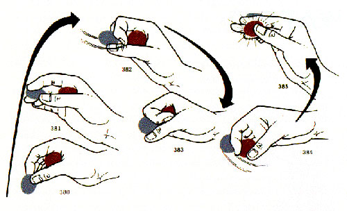
The Science Times ran a great article on magic, perception and consciousness today, and with it came this cool photo set of Teller demonstrating a coin trick. It reminded me of the wonderful third chapter in Edward Tufte’s Visual Explanations — co-written with professional magician Jamy Ian Swiss — “Explaining Magic: Pictorial Instuctions and Disinformation Design,” that examines illustrations like this:

Page 60:
In a difficult manipulation, the magician’s hands quickly exchange a silver coin for a copper one. Timing is crucial in magic, and the complex and rapid performance required for deft conjuring is not easy to illustrate. For this sleight, the author notes that the swift moves “must be done in a one-two-three up and down wave of your hand.” Depicting the action at a rate of two frames per beat, the multiple images flow over time and through space, just as a statistical graph records a time-series… Heavy arrows conduct the rhythm of images, while streamers in frames 382 and 384 indicate finer movements of fingers and coins. In this trick, like many others, small maneuvers of fingers are masked by larger hand movements. To expose the method, these drawings depict the hand tipped at varying angles toward the reader. Yet a slightly different angle of adjustment will assure that the audience sees only a silver coin magically transformed into a copper coin. Magicians are preoccupied with such viewing angles, which make the difference between a successful deception and a disastrous exposure. And so for illustrators: Are readers to see the produced effect or how to produce the effect, or both, and by means of what angles?
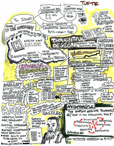
Speaking of Tufte, I was trolling one of my favorite sites, Peter Durand’s Center for Graphic Facilitation, and came across his notes from one of Tufte’s seminars:
Regular blog readers know how fond I am of mind-mapping Tufte: see Beautiful Evidence, Envisioning Information, and my thoughts on the relationship between comics and information design.

The quote about obsession with audience angles reminds me of “The Prestige” . . .
I loved that movie!