My sketchbooks ebb and flow. Whenever I’m working non-stop on a project, my sketchbook suffers. Whenever I’m meandering, reading a lot, wondering what to do next, my sketchbook flourishes. Is there a correlation to my mental health? Almost certainly. Were food and shelter provided for me, I could be content to spend the rest of my days reading and doodling in a sketchbook, finished product be damned.
This afternoon I read Ivan Brunetti‘s interview in Todd Hignite’s IN THE STUDIO. He was talking a lot about grids, and how if you put objects into a grid, they read as a system, or “pleasing geometry,” and viewers automatically start to structure them and find relationships between them. He pointed to this Kandinsky print as an inspiration:
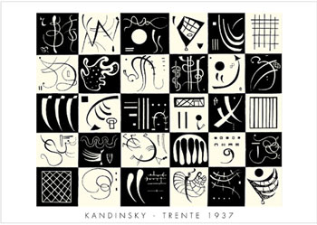
He also related this “putting things into boxes” as part of his definition of cartooning:
The nature of cartooning seems inherently playful, having its roots in a playful kind of drawing, but because you’re putting things into boxes and organizing pages into panels and shapes of rectangles and circles, it automatically has an architectural quality, too.
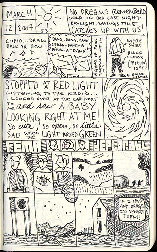
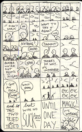
I was talking to Dan Chaon a while back and he told me he uses an exercise with his students where he has them divide a piece of notebook paper into six “panels” and then instructs them to write scenes in each box. I really like this idea of looking at writing as merely a filling of black space. Lately, I’ve been playing with grids in my sketchbook pages:
(I’ve also been copying people’s work: the last five panels are ripped from the amazing Tom Gauld.)
I find that gridding gives way to lots of spontaneous doodling and gaglines…
I’ve also been trying to rip off Lynda Barry and treat my writing as calligraphically as possible–varying text sizes and styles within the same space. Brunetti had a great point in the interview when he said that cartooning wasn’t necessarily drawing, it was more like calligraphy or writing…writing with pictures, as Saul Steinberg would say.
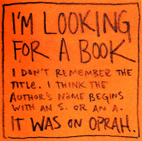
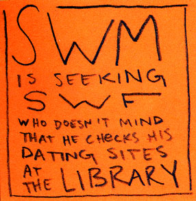
Speaking of putting things into boxes, I can’t really keep a sketchbook at my desk at work, but we have all kinds of post-it notes around, so if there’s a bit of downtime and a flash of inspiration, I’ve been using the post-it as a panel, and doing a quick doodle. Jessica Hagy’s wonderful index cards have already captured the cartoon-on-mundane-office-supply market…but Meg thought these were pretty funny:

” it automatically has an architectural quality, too.”
have you seen the Triumphal Arch prints by Durer? (More on them here) It uses the architectural structure and a means for storytelling.
“as a means” not “and a means”
cool!