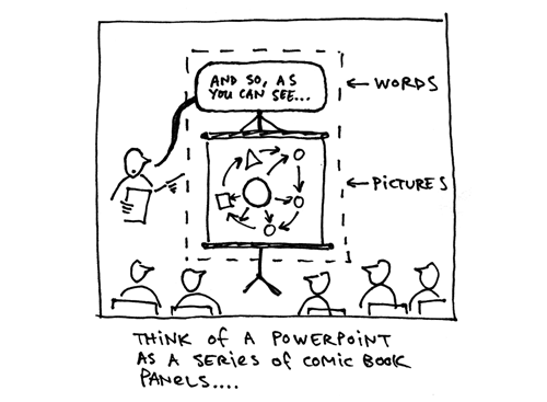
Powerpoint (or Keynote) slide software solves the problem of presenting an audience with a narrative that demands both verbal and visual elements. A slide presentation succeeds when the visual display works with the verbal communication of the speaker to create a narrative in the audience’s mind. The juxtaposition of pictures and words conjure connections and meaning that pictures or words alone could not.
Some of the best uses of Powerpoint come from the masters of verbal/visual, picture/word communication: cartoonists.
On her tour for Fun Home, Alison Bechdel projected panels from the graphic novel as she read the narration aloud:
Scott McCloud uses an epic slideshow to take his audience through his theory of comics:
Chris Ware and radio host Ira Glass have collaborated on “Lost Buildings“—basically a radio story accompanied by a slideshow:
My advice to all who want to use slide software for stronger presentations: read some good comics. Pay attention to pacing, sequence, and the way cartoonists weave verbal and visual elements to tell a story.
Trash the templates, abandon the bullet points, and find the right combination of pictures (your slides) and words (your voice) to communicate your narrative.
Any other cartoonists I’m missing here? What are the best slide presentations you’ve witnessed?
Links:
- Understanding PowerPoint: Q&A with Scott McCloud
Extremely intelligent discussion of Powerpoint in terms of visual language and comics - More posts on Powerpoint

