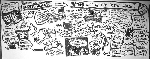
Here are a couple more sneak-preview slides for my part of the VizthinkU Visual Note-Taking 101 seminar. I took my map of Carl Jung’s Memories, Dreams, Reflections and broke it down into pictures, modifiers (speech balloons, captions, etc.) and words.
THE POWER OF CAPTIONS: WORDS ADDED TO PICTURES
Yesterday, I was thinking about telling a story in pictures without words, and so today, in the aftermath of all the Sarah Palin pregnancy conspiracy theory madness, I started thinking about telling a story with words added to pictures.
The documentary filmmaker Errol Morris had it nailed in his NYTimes article, “Photography As A Weapon,” about photoshopping, forgeries, image processing, captions (and John Heartfield and King Geedorah!):
Doctored photographs are the least of our worries. If you want to trick someone with a photograph, there are lots of easy ways to do it. You don’t need Photoshop. You don’t need sophisticated digital photo-manipulation. You don’t need a computer. All you need to do is change the caption.
I don’t know what these buildings were really used for. I don’t know whether they were used for chemical weapons at one time, and then transformed into something relatively innocuous, in order to hide the reality of what was going on from weapons inspectors. But I do know that the yellow captions influence how we see the pictures. “Chemical Munitions Bunker” is different from “Empty Warehouse” which is different from “International House of Pancakes.” The image remains the same but we see it differently.
Change the yellow labels, change the caption and you change the meaning of the photographs. You don’t need Photoshop. That’s the disturbing part. Captions do the heavy lifting as far as deception is concerned.
If you read through this Daily Kos piece, the writer presents pictures of Palin at various stages of her pregnancy looking thin and trim as “evidence” that she wasn’t really pregnant with her fifth child, but it was her daughter, Bristol, who was pregnant. The article is simply a list of photographs with captions—and the captions control how we read the photographs.
Many folks pointed to this picture as evidence of a Bristol Palin “baby bump”:
A picture which would otherwise be an innocuous portrait of a nice-looking family is turned into a sinister conspiracy by the words, or caption, adjacent to it.
The moral of the story is that pictures can say whatever we want them to say, provided we use the right words.
The power of captions can be used for good, or it can be used for evil. For a cartoonist, it’s a potent weapon, which can take any drawing and turn it in many different ways. Take this hasty doodle:
Depending on which captions I use, you’ll get a different picture of who I am, yes? In comics, it seems, the old creative writing adage “show don’t tell” is useless—you can certainly tell as much as you show, show what you tell, or tell what you show.
I’d love to hear your own thoughts on the use of captions in the comments below. I also recommend taking a look at Derik Badman‘s article, “Text In Comics.”
VISUAL THINKING
this one is dedicated to lynda barry and her new book which looks amazing
pretty much a paraphrase of this page:
TWO BRILLIANT QUOTES ABOUT CARTOONING
Chris Ware’s Introduction to The Best American Comics 2007
…lately I find myself frequently torn between whether I’m really an artist or a writer. I was trained and educated as the former, encouraged into the world of paint-stained pants and a white-walled studio where wild, messy experiments precipitate the incubation of other visual ideas— though I’m just as happy to sit at a desk in clean trousers with a sharp pencil and work on a single story for four or five days in a quiet and deliberate manner. In short, I’m coming to believe that a cartoonist, unlike the general cliché, is almost—bear with me now—a sort of new species of creator, one who can lean just as easily toward a poetic, painterly, or writerly inclination, but one who thinks and expresses him- or herself primarily in pictures.
A lengthy interview with Anders Nilsen:
When I set out with a clear idea of what I want to do, it becomes super simplistic and neither illuminating to me nor the readers, so that doesn’t work. It sort of just happens by accident, really. I think it’s because I’m interested in these things, so when I draw the first panel, for me to draw the second panel it will have to have dealt with something. The biggest issue is how to get out of your own way, how to explore issues without forcing it, without forcing yourself to do it. If you do ten pages of comics that are just not interesting, you’ve just got to throw it away.
MORE MAPPING
Here’s another map I did with the ol’ sumi-e brush for an essay I’m working on. The piece of paper was really huge, so I had to take a photo with the digital camera. I had all this random junk floating around my head for the essay, but I couldn’t figure out how to put it in linear, narrative form. I started out thinking this would be another radial map (I started with the black box in the bottom-middle), but it ended up with a horizontal flow (what you see is only the top half of the sheet). This was a happy accident, and in the process of drawing the map, I realized the narrative that was hiding amongst all the random junk.
The quote by McCloud in the top, lefthand corner is from chapter 6 of UNDERSTANDING COMICS, “Show and Tell.” Notice the creative writing professor repeating the mantra of workshop: “Show, don’t tell!”
(I should note that even though I often take shots at creative writing workshops, my own workshop professor was wonderful: I took all my workshops at Miami from him, and he is still a good friend of mine. He’ll even be at the wedding!)
WILLIAM BLAKE, READING COMIC BOOKS
“The staple reading for all children in the period of Blake’s infancy was the chapbook — stories from British history, the true confessions of criminals about to be executed at Tyburn during ‘Paddington Fair’, myths and legends of uncertain provenance such as The History of the Two Children in the Wood — printed on cheap thick paper and accompanied by clumsy if vivid woodcuts. These ‘cuts’ show children dancing ‘in the round’, chasing butterflies, and spinning hoops; but there are also images of forests ‘dark and drear’, of crippled beggars and wayfarers offering an appropriate subject for infant contemplation, of deathbed scenes to remind the little children of mortality. Blake may also have read such illustrated books as Pine’s Horace and Croxall’s Aesop, and his later interests suggest that he had at least glanced at The History of Jane Shore as well as at The History of Joseph and His Brethren; but it is important only to note that, from the beginning, he saw words and images together in the morbid mid-eighteenth-century equivalent of comic books.“—Peter Ackroyd, Blake: A Biography, (emphasis mine)
DOUBLE-SPACED, 12 POINT, TIMES NEW ROMAN STRAIGHTJACKET
Short week, this week, what with the holiday coming up and all.
Had a marvelous weekend full of running around and reading books. My reading habits are fluctuating wildly these days between non-fiction, books on design, and comic books. Not too much interest in prose fiction at the moment, although I’ve been dipping into Oliver Twist (which is pretty hilarious, actually, and kind of like a verbal cartoon) here and there.
I spent a lot of this weekend watching football (!): Michigan vs. Ohio State, Notre Dame vs. Army, and the Browns vs. Steelers. This guy named Frank Caliendo does a hilarious John Madden impression. There’s something about John Madden’s voice that makes me depressed — all those wasted Sunday afternoons in front of the TV with my uncles.
[gv data=”OSc3e4RoYhA”][/gv]
Oh, and Taxi Driver was on AMC Saturday while we were at Meg’s parents. DeNiro is such an absolute joy to watch:
[gv data=”oHzMfab9ULg”][/gv]
* * *
This is a quote from a book called Reading Images: The Grammar of Visual Design:
Until now, language, especially written language, was the most highly valued, the most frequently analysed, the most prescriptively taught and the most meticulously policed code in our society. [If] this is now changing in favour of visual communication, educationalists should perhaps begin to rethink what ‘literacy’ ought to include, and what should be taught under the heading of ‘writing’ in schools. If schools are to equip students adequately for the new semiotic order, if they are not to produce people unable to use the ‘new writing’ actively and effectively, then the old boundaries between ‘writing’ on the one hand, traditionally the form of literacy without which people cannot adequately function as citizens, and, on the other hand, the ‘visual arts’, a marginal subject for the specially gifted, and ‘technical drawing’, a technical subject with limited and specialized application , should be redrawn.
Yep, double-spaced, 12 point, Times New Roman font is a straightjacket that I won’t wear any more. I won’t do it. No sir.
BACK TO SCHOOL?
“Drawing is easier to teach than critical thinking. Don’t get me wrong, rendering well is a tremendous asset for a cartoonist. Still, I think it is often over emphasized. In fact, many of the great cartoonists sublimate their drawing skills and instead favor a style that relies more heavily on graphic design. They distill images until they function more as language or picture-writing.”— James Sturm, journal for Slate.com about running the Center for Cartoon Studies
Here’s what I want: I want a graduate program (MFA, MA, PhD, whatever) that combines a great books program, a creative writing MFA program, a studio art MFA program, a graphic design program, and an information design program, all rolled into one. It’s contents will look something like this:
design courses:
- information design (including diagramming, cartography, infographics)
- typography
- graphic design
- book design, publishing
art courses:
- figure drawing
- color theory
- printmaking (including woodcut and screenprinting)
writing courses:
- fiction/non-fiction/graphic novel workshops
reading list:
- Shakespeare, Dickens, Bible
- Tolstoy, Dostoevsky, Chekhov, Gogol, Babel
- Flannery O’Connor, Faulkner, Barry Hannah
- Vonnegut and Elmore Leonard (in cheap paperback)
- Edward Tufte, all books
- comics, comics, and more comics
software training:
- QuarkXPress, Illustrator, Flash
If anyone out there knows of such a place, contact me immediately.
Until then, I’ll be tearing my hair out, scouring Google, studying for the GRE, and trying to fit what it is that I want to do into some kind of disciplinary track of study.
If you want to study pictures, there are places for that. If you want to study words, there are places for that, too. If you want to study pictures and words and what happens when you put them together? Good luck.
IT’S EDUCATIONAL!
This is a couple-of-months-old page from the first draft of Calamity, when I really didn’t know where I was going (as opposed to now — HA!), and there were twin brothers in the story. I like the background a lot, but the layout is pretty boring: a lot of cut-and-paste and stage-like monologuing. The good news, as we all know, is that you learn just as much by failing as you do by succeeding, and considering that I’ve already thrown out a couple dozen finished pages of artwork, I’m learning a hell of a lot…
There’s something about this time of year, when that fall breeze starts creeping into the air, I immediately think: time to go back to school! But last September, after 17 years, that butterfly in my belly was pinched by the disappointing fact: you’re no longer a student.
Or at least a student who pays tuition.
So, today I’m going to post a couple of quotes by different comic artists about teaching yourself how to do this thing.
* * *
“A comics-art curriculum is interdisciplinary. As comics-art students learn to become literate and visually literate, they need to develop a vast array of skills. They need classes in drawing, writing, computer art, literature, storyboard, and character design. They need research skills, so they can make their stories convincing and make their characters behave and look real enough to come alive on the page or screen.”
– James Sturm, “Comics In The Classroom“
* * *
“…[he] discovered Dickens and Lewis Carroll and Thackeray, superb story-tellers whose tales were often co-created with the most gifted comic artists of their time. Dickens would toil over the drawing board with cartooon illustrators like Cruikshank and Browne (Phiz) to get the graphic portrayal of a character like Sairey Gamp or Mr Pecksniff exactly right, considering his novel illustrations an integral part of his books. (In our desolate time, publishers have no knowledge of this and routinely repting Dickens sans the crucial cartoon art.) George reveled over these novel combinations of art and text and longed to tell stories involving his own comic characters developed in depth over time…”
– Bill Blackbeard on George Herriman, creator of Krazy Kat, in his introduction to Krazy & Ignatz 1931-1932: A Kat a’Lilt with Song
* * *
“This book was created on a lark. Actually, it was never even intended to be a book at all — merely an exercise in one of my sketchbooks. Around the time I began doodling it out, I had been particularly interested in a certain kind of storytelling I had noticed several other cartoonists working with — specifically Dan Clowes, Chris Ware, and David Heatley. It’s an approach wherein you tell a longer story through a series of shorter, unconnected comic strips. Cumulatively they add up to a bigger picture….I went in knowing very little about where the story was going. I made it up page by page as I drew it out….The whole thing was just meant to be fun.”
– Seth, “The Origin of Wimbledon Green”
IT SEEMS A SHAME TO CHOOSE
“When you have the talent to be able to write and to draw it seems a shame to choose one. I think it’s better to do both.”
I love to draw portraits. In every human face, there’s a story, only you don’t have to necessarily tell the story, you just look at the face, and there it is. The only trouble with drawing portraits: it’s hard to get people to sit still for you. That’s why I tend to draw my best portraits in conference rooms–when people are trapped in badly-lit rooms in front of Powerpoint presentations. (If I rode the subway to work, it’d probably happen there.)
These two might become part of an ongoing project that I’ve dubbed “A Life Spent.” It would be rough portraits of people accompanied by an educated or imaginative guess as to where they’ve spent (or where they look like they’ve spent) the majority of their time. Maybe we could get some audience participation involved, and I could draw the portraits, and you guys could guess where they spend their lives…
* * *
Satrapi’s quote has become my new motto. Why do you have to choose? Well, the answer could be, because how will you ever get in to grad school if you don’t? I think I might be able to make a career out of starting an MFA program in visual storytelling…
* * *
Here are some links: trace the evolution of speech balloons, learn how to copy the New Yorker DVD set (I’ve been thinking about making my own portable hard drive with the recently reincarnated 2.5 inch notebook drive I have leftover from the Powerbook fiasco–did I tell you the Powerbook is fixed??? Because it is!!!), read an interview with Eddie Campbell, ruminate on The Pitchfork Effect (which I read religiously in college), watch the Islands playing on the streets of Paris (they’re coming back to the Grog Shop!), and listen to Charlie Baxter talk Flann O’Brien on NPR (I read the beginning of THE THIRD POLICEMAN on break…it was nutty. And did you know THE FEAST OF LOVE is being made into a movie starring Morgan Freeman?)
Also, the full excerpt of the Osama/Whitney connection from Harpers.
And: if you’ve never read Persepolis, I’ve put up an intro page on the Pizza and Prose Myspace blog. Check it out.