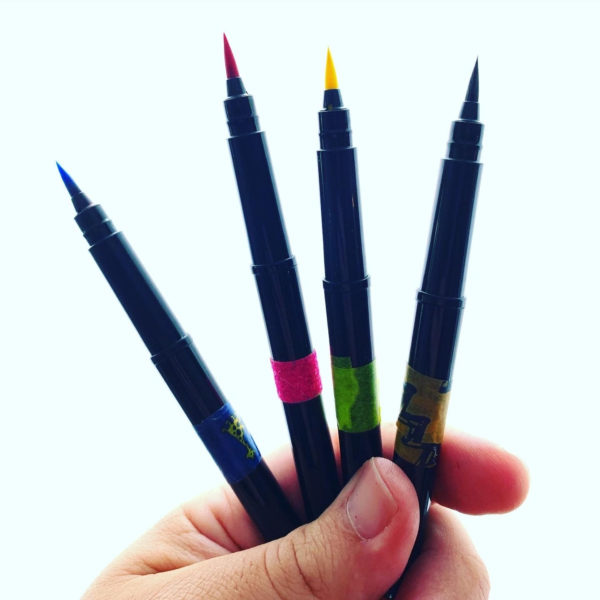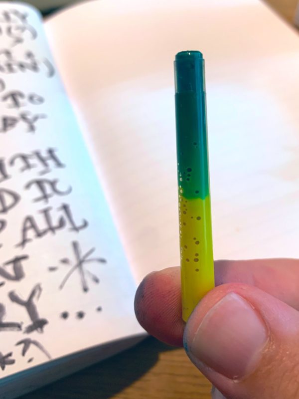
Whenever I empty out a black ink cartridge that comes with one of my beloved brush pens, I think about adding another color to my set. This week I added a green by filling about 2/3 of the cartridge with lemon and the last 1/3 with blue:
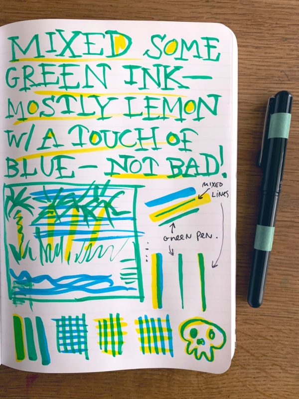
It’s pretty, but it’s also interesting how easy it is to get green by drawing yellow and covering it with blue. Also, I really like the constraint of the CMYK brushes.
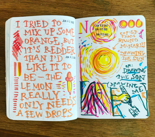
What I could really use is an orange. (Magenta on top of yellow just gets a vibrant red.) I think the same mix ratio (2/3 lemon, 1/3 magenta) should do the trick. Will report back later!
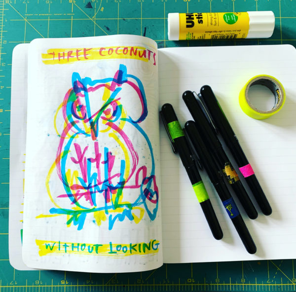
Update (6/2/2022) I mixed some orange, too:
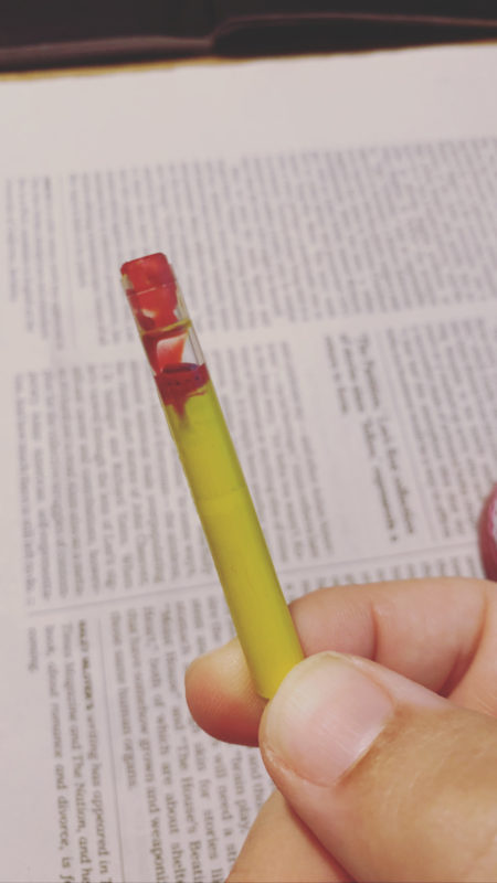
Not bad!
PS. Here’s how I fill them using a blunt-tipped syringe: