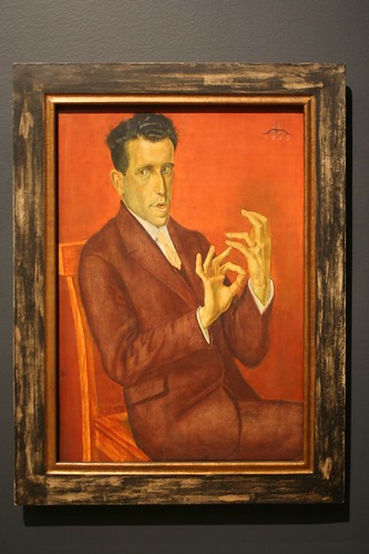
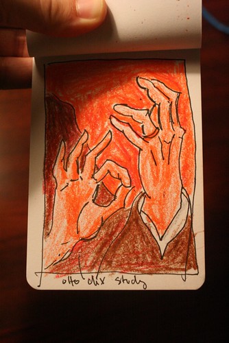
This 1929 portrait is the best thing hanging in the Montreal Fine Arts Museum. Absolutely stunning.
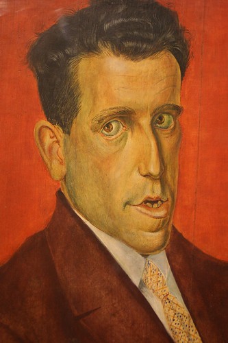
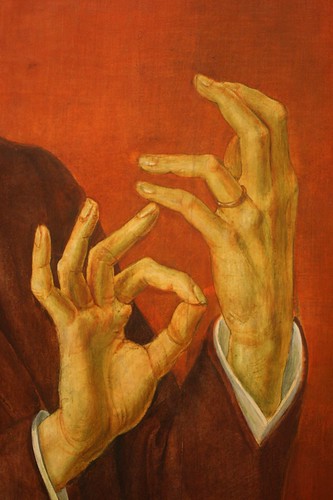
More on Otto Dix, who was part of the amazing Glitter and Doom show we saw on our honeymoon.
This 1929 portrait is the best thing hanging in the Montreal Fine Arts Museum. Absolutely stunning.
More on Otto Dix, who was part of the amazing Glitter and Doom show we saw on our honeymoon.
Rinse and repeat.
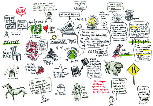
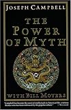
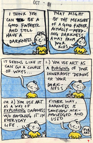
Do ever feel like when you’re reading, you aren’t really learning anything, but you’re re-discovering what you already had inside you? That’s how it felt after reading The Power of Myth, a book companion to the PBS mini-series featuring Bill Moyers and mythologist Joseph Campbell in conversation. Having never read any Campbell (I’m starting on The Hero With A Thousand Faces next) I found it to be a great introduction to his worldview.
Campbell had a lot of wisdom for artists, but here are two of the more practical excerpts.
On having a “sacred place”:
[A sacred place] is an absolute necessity for anybody today. You must have a room, or a certain hour or so a day, where you don’t know what was in the newspapers that morning, you don’t know who your friends are, you don’t know what you owe anybody, you don’t know what anybody owes to you. This is a place where you can simply experience and bring forth what you are and what you might be. This is the place of creative incubation. At first you may find that nothing happens there. But if you have a sacred place and use it, something eventually will happen….
[O]ur life has become so economic and practical in its orientation that, as you get older, the claims of the moment upon you are so great, you hardly know where the hell you are, or what it is you intended. You are always doing something that is required of you. Where is your bliss station? You have to try to find it. Get a phonograph and put on the music that you really love, even if it’s corny music that nobody else respects.
On how to read:
Sit in a room and read—and read and read. And read the right books by the right people….When you find an author who really grabs you, read everything he has done. Don’t say, “Oh, I want to know what So-andso did”—and don’t bother at all with the best-seller list. Just read what this one author has to give you. And then you can go read what he had read. And the world opens up in a way that is consistent with a certain point of view. But when you go from one author to another, you may be able to tell us the date when each wrote such and such a poem—but he hasn’t said anything to you.
(This is something that both my friend Brandon and George Saunders have suggested.)
Great book. Highly recommended. Here are some other excerpts.
On inspiration:
[M]yths, fairy-tales and religious stories like the Bible…They are endlessly interpretable and adaptable. A bottomless source. They’re the template for pretty much all storytelling in the Western world. Whether by design or by stumbling onto them I think there is much to be gained from brushing up against them, borrowing, stealing, rewriting and quoting from them, whether subtly…or overtly…”
On not-knowing:
…when making comics is working, it really doesn’t feel like you are the one telling the story, it feels like the story already exists and you are just doing your best to get it down on paper. It’s like a very carefully attentive manufacturing process. So for the story to change would be like for someone who assembles calculators to start changing the calculators. They probably wouldn’t work.”
On art and religion:
All art comes from religion. From trying to understand and contend with the world.”
On the artist disguising himself in his work:
I’m happy to be back to my usual practice of heavily disguising my life in the stories I tell. Generally speaking, it’s still me in my other work, it’s just that I’m disguised as a bunch of little birds.”
This site participates in the Amazon Affiliates program, the proceeds of which keep it free for anyone to read.