Search Results for: newspaper
BROADSHEETS
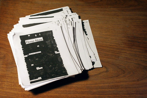
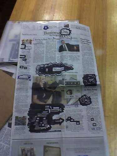
3 or 4 months ago I did a batch of full-page “broadsheet” newspaper blackout poems — using the entire page of the newsprint. I soon realized they were a lot of work, and I probably couldn’t use them for the book anyways. So I dropped them. I did, however, take the time to scan a couple and found the scans recently on my hard drive. If you click the images below you can read them. I’ve also included a few “in progress” shots.
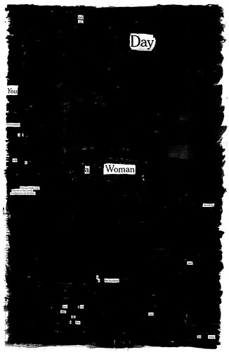
“On The Day”

* * *
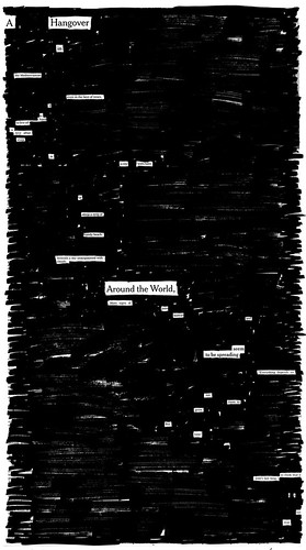
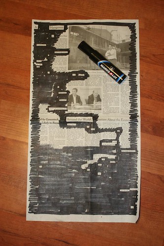
“A Hangover In The Mediterranean”
* * *
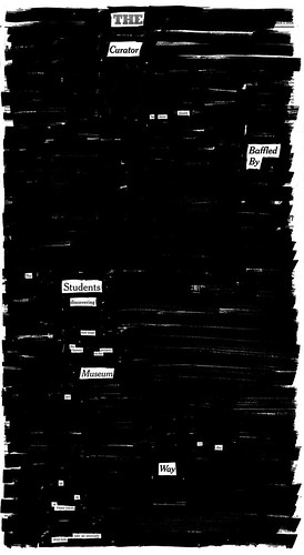
“The Curator”
* * *
“Olympic Games”
* * *
It’s funny, looking at these again, I’m reminded of how important size and dimensions are to the success of the poems.
Normal-sized, they’re really easy to read (usually) on one monitor screen. I’ve always tried to make them the size of a paperback book. (Wishful thinking?)
Broadsheet-sized, they’re really hard to get a look at online–they take a long time to load, and you have to do a lot of scrolling.
My guess is that if I’d only worked on full-paged poems, they’d never become as popular as they have. I’m not even sure they’d work well as posters — it’d just be a sea of black hanging on a wall.
No matter!
* * *
In other news, here’s some blackout fan mail that I received the other day from a girl who grew up near me (we’ve never met). It was one of the funniest e-mails I’ve ever received:
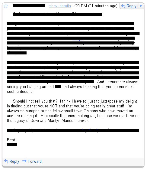
I took it as a compliment.
TRAILS
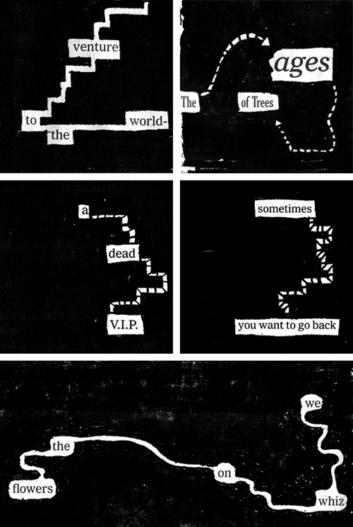
When making a blackout poem, sometimes you can get around the Western left-to-right, up-to-down reading problem by using little connecting lines between words. These are a couple recent examples from poems I’m working on for the book.
I didn’t know this until a couple of days ago, but in comics, Scott McCloud calls them “trails.”
* * *
In other news, there’s now a Newspaper Blackout Poems Flickr pool — join the group and share your own!
GET YOURSELF A CALENDAR
Several months ago, I was at a talk by comics artist Jessica Abel, and somebody asked her for her number one productivity tip. She said, “get yourself a calendar. Here’s what she has to say (emphasis mine):
“Get yourself a calendar, and schedule the work you have to do in there. Make sure the calendar is the type where you can see a day or a week at at time (not a month at a time), so there’s room to write under each day. Then, mark in any regular commitments you have…Once you’ve got all that there, you will be able to see how much time you really have to work….In the time you have for work, assign yourself very specific tasks…Taking a little time to get all this in your book will do several things for you. It will become clear to you how much you can reasonably get done in a week. It will become clear where you might need to shorten your daily activities to fit in more drawing. And, most importantly, it will give you concrete goals, so that when you finish what you set out to do, you can cross it off and feel good about yourself, and you can also stop working, sometimes the hardest thing to do for a freelance artist. Knowing when you’re on and what you need to get done makes your free time, once you’ve accomplished these goals, truly free, guilt-free. And that’s the most important part of learning to make a life as a working artist.”
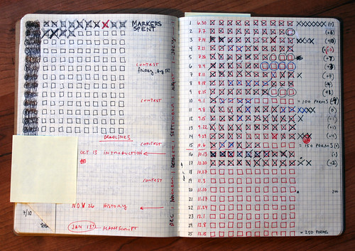
When I started the book at the end of June, I knew I had six months to get the manuscript finished. 25 weeks to make 150 brand-new poems. That’s 6 poems a week, one poem a day…if I took a sabbath. But there was no way each poem was going to be worthy of being collected in the book. So I decided to shoot for a 3/5 success rate (which is still way too optimistic), and make 250 poems in 25 weeks. 10 poems a week. Out of the 250, I’d throw out 100, and still have 150 for the book.
250 poems!
I couldn’t see it happening, so I drew it. 25 rows, 10 checkboxes. If I was doing everything right, by Christmas all the checkboxes would be full.
And that’s how I’ve been living for the past four months. Every week, there are 10 checkboxes to be filled, and I fill them. At the end of every poem, there’s the satisfying X.
Creating any long work of art is all about time management. Any goal you want to accomplish: get yourself a calendar. Break the task down into little bits of time. Make it a game.
THE LITTLE MAN

Yesterday I read this little paragraph in Roger Ebert’s response to claims that he gives out too many stars:
The only rating system that makes any sense is the Little Man of the San Franciscio Chronicle, who is seen (1) jumping out of his seat and applauding wildly; (2) sitting up happily and applauding; (3) sitting attentively; (4) asleep in his seat; or (5) gone from his seat….The blessing of the Little Man system is that it offers a true middle position, like three on a five-star scale.
So I did a little research. The Little Man was the creation of Chronicle artist Warren Goodrich in the early 40s:
On the occasion of the Little Man’s 50th birthday, Goodrich recalled it was just another assignment that he dashed off quickly, noting, “I’m surprised (it) continued.”…Goodrich, who died last year, once recalled that a woman (possibly a disgruntled actress) once hit him on the head with her umbrella and said, “I hate the Little Man!”
The woman isn’t alone. Many of the writers at the Chronicle hate The Little Man. They boo-hoo that the picture already tells the story!
The beloved icon of this newspaper’s entertainment sections is, in fact, a complete nuisance to criticism….That’s because the Little Man gives you a visual clue to what you’re about to read.
And they complain about what Ebert loves: the middle man on the scale—the man with ambiguous feelings.
[T]he message is often unclear…when he’s merely sitting in his chair, watching. Not clapping. Not jumping out of his seat and clapping. Not slumped in his seat. Not out of his seat. Just sitting there.
I suppose a comment could be made here about how people can’t handle ambiguity in their lives: they want things to be black and white, with no shades of grey. As Ebert quotes Siskel,
“What’s the first thing people ask you? Should I see this movie? They don’t want a speech on the director’s career. Thumbs up–yes. Thumbs down–no.”
In fact, the editorial staff was so bothered by the neutral middle man that they had him redesigned:
Few are aware that the L.M. was retrofitted about 10 years ago with a more benign expression. The Little Man pose in between the politely applauding and the snoozing Little Man was redesigned in a microscopic makeover: the “alert viewer” Little Man’s expressionless mouth was tweaked with a slight upturned curve, to indicate a hint of a Mona Lisa smile, suggesting a vague amusement. His raised eyebrows indicate interest but not quite approval, denoting mixed feelings. After artistic spinal fusion, he also sat up more alertly, signifying a mixed review.
All of this came after Talmudic editorial discussions about the meaning of the enigmatic No. 3 Little Man: Did his indecipherable gaze indicate intrigue or ennui? Polite diffidence or glazed-eyed apathy? As a Datebook editor noted, “He’s the middle child, and the most unmanageable.”

I say: 3 on a 1 out of 5 scale should be ambiguous and neutral. Instead, he’s upright as if he’s engaged and smiling, as if he’s liking it. His back should be against the chair:

And to be totally ambiguous, his mouth should be a straight line (or no line at all), with no eyebrows. A blank face:

An ambiguous visual calls for explanatory text! And so, the neutral man is a friend to the good critic: if the visual is ambiguous, then the reader should be more tempted to investigate the article text to get the writer’s take!

Note: this was a repost from my tumblelog. Apologies for doubling up.
- ← Newer posts
- 1
- …
- 62
- 63
- 64
- 65
- 66
- …
- 84
- Older posts→