“Imagine a widely used and expensive prescription drug that promised to make us beautiful but didn’t. Instead the drug had frequent, serious side effects: It induced stupidity, turned everyone into bores, wasted time, and degraded the quality and credibility of communication. These side effects would rightly lead to a worldwide product recall.”
—Edward Tufte, “Powerpoint Is Evil.”
Nothing makes you want to off yourself like a chilly conference room and a dreadful Powerpoint presentation. Unfortunately, when I was in high school, nothing secured an easy A like a Powerpoint full of chartjunk. Tufte, again:
Particularly disturbing is the adoption of the PowerPoint cognitive style in our schools. Rather than learning to write a report using sentences, children are being taught how to formulate client pitches and infomercials. Elementary school PowerPoint exercises (as seen in teacher guides and in student work posted on the Internet) typically consist of 10 to 20 words and a piece of clip art on each slide in a presentation of three to six slides -a total of perhaps 80 words (15 seconds of silent reading) for a week of work. Students would be better off if the schools simply closed down on those days and everyone went to the Exploratorium or wrote an illustrated essay* explaining something.
In college, I smartened up, and realized that just because a Powerpoint was required, didn’t mean it needed to be bad. I began creating Powerpoints of pure images–no text at all. For my Summer Scholars project, I used scans from my rough drafts and sketchbooks as background while I spoke, and for my senior project fiction reading, I Powerpointed illustrations up on the screen while I read the story.
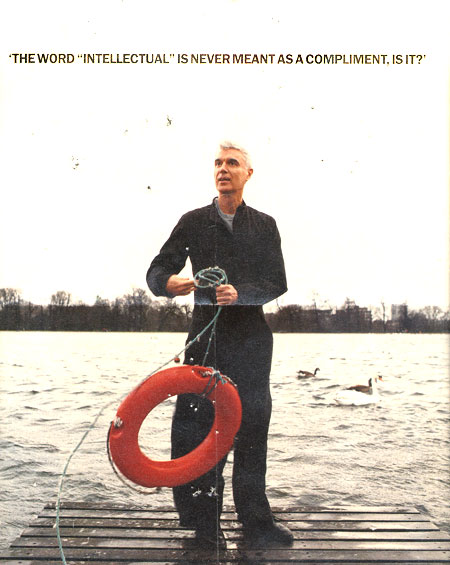
What I discovered, by my own observations, and then by reading Tufte’s devastating pamphlet, THE COGNITIVE STYLE OF POWERPOINT, was that certain information — statistics or charts or logical arguments or even prose stories — is all but ruined by the low-resolution, low-information output Powerpoint slide format, while visual images thrive (David Byrne took advantage of this in his book of Powerpoint art.)
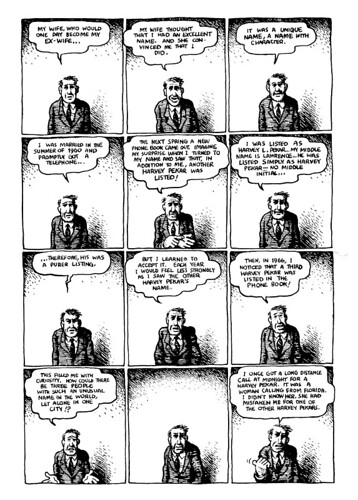
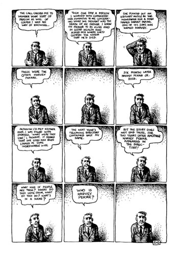
Add to that, I’ve always wondered how you could do a cool author reading for a graphic novel. Turns out the answer is powerpoint. First, I saw the LOST BUILDINGS DVD project that Chris Ware and Ira Glass did for NPR. Ira read the story, while Ware’s images were projected on a giant screen. (See a preview.) Then I found out that for her readings, Alison Bechdel projects the comic panels from FUN HOME in Powerpoint, while reading aloud from the narration.
Comics + Powerpoint = Good?
*Bonus: Here’s Tufte on cartooning.