We made it. 1400 miles. The Honda took the trip like a champ. Our life was crammed in the trunk and a rented mini-van. Our apartment is great, but empty. The neighborhood is great. The city is great. Tacos and lemonade for dinner. It’s hot and beautiful. The air conditioning is on. I’m trying to put together an Ikea chair without instructions. Boxes are everywhere. I have a job interview at ten in the morning. Life is good.
GREENVILLE, TEXAS
It’s 11 o’clock Texas time, and we’re chilling at the LaQuinta Inn in Greenville, Texas, 45 minutes east of Dallas. In Greenville, they used to have BLACKEST LAND, WHITEST PEOPLE, painted on the water tower. Luckily, that isn’t the case anymore.
We swam in the pool, grabbed warm chocolate chip cookies at the front desk, now we’re watching some cable. Today we drove to Memphis and did something I never thought we’d do.
We went to Graceland.
Fun facts about Elvis that I did not know, and did not learn from the Graceland tour, but from my mother-in-law: that Priscilla was 14 when she met Elvis, and that “the king died on the throne.”
Here’s a fun sign on Vernon Presley’s (Elvis’s dad) office door:
I couldn’t get a good picture of Elvis’s office, but there were books about football, karate, World War II, and, oddly enough, Hermann Hesse’s Siddhartha.
We drove out of Memphis, through Little Rock, and ate at the Whataburger in Texarkana:
The drive from Texarkana to Greenville was gorgeous. Meg saw her first armadillo by the side of the road.
Tomorrow, we’ll be Austin, in our new apartment. Unbelievable.
NASHVILLE
PROCESS: MY COVER FOR HAWKLINE’S UPCOMING EP, “SHIPWRECK”
I usually don’t talk much about my individual process here, mostly because I’m not sure who’d be interested, but today I thought I’d break with precedent and take you step-by-step through a recent project I did for my buddies in the band Hawkline.
Long story short, they saw my work on Calamity, said they were putting out an album called “Shipwreck,” and that my stuff might be a good match. So I said, “Cool. Let’s do it.”
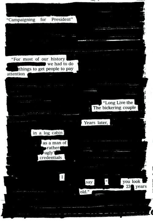
I tend to look at everything through the medium of collage: all we’re really doing with art is taking things that we’ve seen and making something we can call our own. Borrowing. Stealing. Mixing. We take the words we know and put them into sentences. We take the notes we know and put them into melodies. We take the experiences we have and shape them into stories.
Etc.
I’d say that 90 percent of my process is fumbling around in a sketchbook, 10 percent is execution. In this case, they caught me in a brush phase, so I came up with this concept:
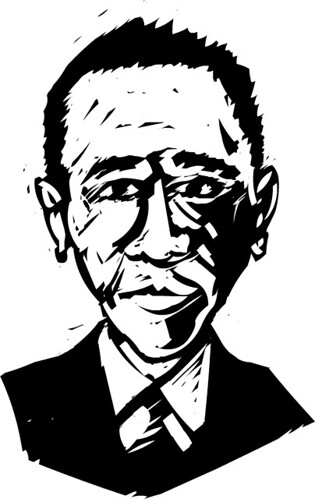
What did Picasso say? “Good artists borrow, great artists steal?” Well, I ripped that cover idea off of an old engraving I came across:
Anyways, the band liked the idea, but decided they wanted to put out an EP before the album. I thought I could do a lot better than the original design, so I started looking for inspiration. I remembered R. Crumb’s cover for Big Brother and the Holding Company’s Cheap Thrills:
Funny story about that cover: originally it was supposed to be the back cover for the album, but Janis liked it so much she had it put on the front. But anyways, I liked the way the artwork was splintered into comic panels, so I said, “Okay, sure — I’ll rip that off with woodcuts.” I began doodling on post-its for a layout:
At this point, I thought I had a good idea of where the cover was going, so before making a bunch of artwork, I decided to finish their logo first. A couple of months back I had already doodled some logos while staying at Corey’s house. Hawkline’s sound is pretty muscular, so I wanted something stark and simple. (Something that would look good on a sticker or a tattoo.)
There just happened to be a Ketel One Vodka ad staring up at me from the back cover of a Rolling Stone:
Now, the font that Ketel uses is just a font called Bradley, that all kinds of places use:
So I ripped that off:
And came up with a final version. Keep in mind, I’m hand-lettering this:
I liked that a lot, so I thought I’d just do the title of the EP in the same font as a kind of anchor for the cover. I also played around with layouts, drawing a bazillion thumbnails:
Now that I had the layout pretty much figured out, I concentrated on the final artwork. I found these cool woodcuts by an artist named Kim Atkinson:
With those as inspiration, I finished the front cover:
Now to the back. The band members said they’d be interested in having me cartoon them, so I had them send me some mugshots:
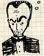
Which I used to doodle caricatures:
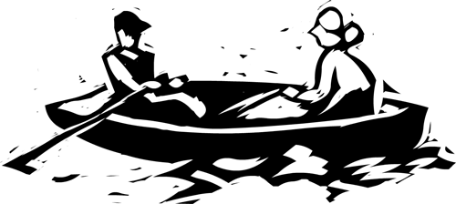
I thought the idea of a band playing in a lifeboat was a fun one, so I used that and hand-lettered the information they wanted listed for the back cover:
I have to admit, I almost like the back cover more than the front. Since the cover and the back were so busy, I thought a simple CD design was the way to go:
So there you have it. Hope that wasn’t too terribly boring. Check out Hawkline. The guys have my favorite song, “Stop Your Cryin’,” [MP3] streaming on on their myspace.
THE FEAST OF LOVE
I had completely forgotten that Charles Baxter’s The Feast of Love is going to be a movie. Meg and I read this book aloud to each other when we first started dating. “Hey Ya!” is our song, Lost in Translation is our movie, and Feast of Love is our book. We’ve also met Charles Baxter, who was really fantastic, but assured us that we were not the first couple to declare that the book had brought them together — people have actually read from it at their wedding. I really hope the filmmakers don’t screw it up…
- ← Newer posts
- 1
- …
- 518
- 519
- 520
- 521
- 522
- …
- 619
- Older posts→