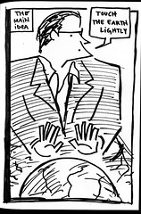
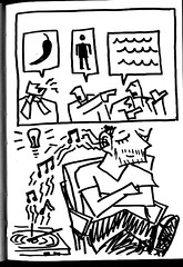
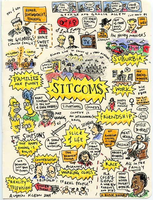
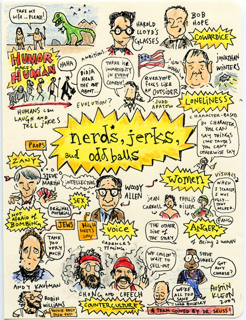
Just got back from the third Vizthink Austin meetup. Daniel Saltzman of Enspire Learning gave a terrific presentation on visual metaphor. An excellent subject, as one of the most important and helpful bits I’ve learned about drawing and writing is that all marks on paper are metaphors.
Some equations:
- the unknown <– metaphor –> the known = learning
- love ? mediocrity
His steps to using visual metaphor in a design setting:
- Start with the content
- Find the emotion
- Consider your audience
Saltzman talked a lot about using metaphors from nature, and so I asked about clichés—whether they were good or bad. His answer impressed me: “when you’re short on time, use clichés.”
(And Kay Ryan popped into my head—”Poets rehabilitate clichés.”)
At the last meeting, I mentioned that visual thinking is nothing new: it’s a forgotten art, something we have to rediscover:
Tonight Saltzman said the same thing: This is not something new, this is a return.
Also: something weird happened while I was drawing—the first thing I drew on my notebook was the awful Austin traffic I had to sit through to get to the meeting…as I drew (roughly) counterclockwise, towards the end, I made a note about giving users the illusion of freedom by allowing them to move through space within a linear narrative (Saltzman was showing us an Enspire training module, but I immediately thought of the LucasArts adventure games of my youth). Anyways, just I drew the word freedom, I realized it was pointing at the traffic:
What’s maddening about traffic? The lack of freedom! What gives the illusion of freedom? Weaving in and out of traffic—moving through space—while still following a linear path!
Behold, the power of mindmapping and visual thinking! The connections otherwise not made!
Other subjects touched on that merit further reading: