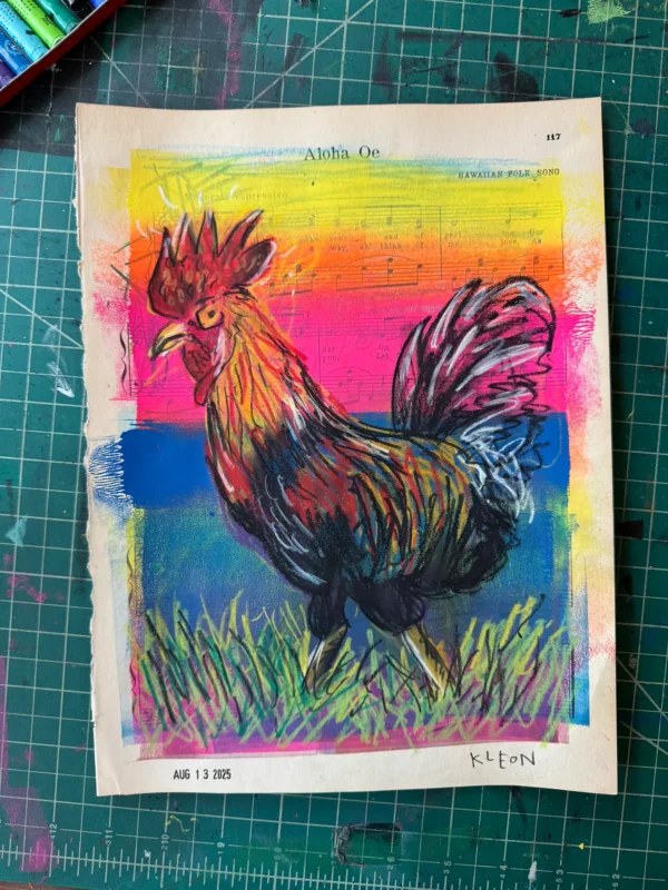
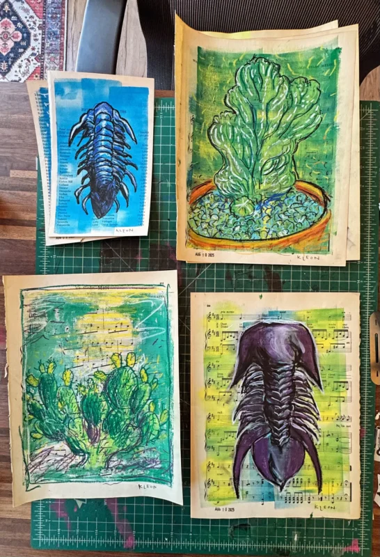
I’ve been experimenting with color drawings in the studio using fancy crayons on top of block printing ink.
Here are items #1 and #2 from Friday’s letter, “Somebody needs to know the time”:
1. I did a lot of design work on the next book this week, a lot of it constrained by what you can do in black and white on a 6″x6″ page. To take a break from greyscale, I’ve been doing a bunch of color drawings in the studio on old pages of sheet music. I’m using a set of Caran d’Ache Classic Neocolor II Water-Soluble Pastels I picked up after learning about them from Tom Sachs. (I may splurge on the big set when these are used up!)
2. Walt Disney said he thought Mary Blair must be colorblind because she came up with such amazing color combinations. I’m red-green colorblind, and most of my life I’ve been scared or confused by color. (My collage work and my block printshave helped me loosen up a bit.) I’m in awe of people who can really do color, and part of my urge to use color this week came from reading cartoonist Tara Booth’s Processing: 100 Comics That Got Me Through It. Booth’s formally trained (and her grandparents are watercolor artists!) but her use of color is just so free and unexpected, it makes you want to join along in the fun. Check her out on Instagram: @tarabooth.
And from Tuesday’s letter, “Your hobby looks exhausting!”
Here are some drawings that showed up in the studio this weekend — they came because I wondered, What if I drew over roller-ed block ink instead of printing over it?
This happens a lot: If I mess around long enough on a creative hobby or side project, pretty soon a body of work starts to show up. I wonder what the heck I’m going to do with it. But the best way to keep it going, for me, is to not jump at answering that question right away, to keep it looking silly and pointless — even to myself! — for as long as I can, so the pieces keep stacking up.
Filed under: color