I don’t blog much about my web design work, because as Bob Dylan sang in “The Hurricane,”
Its my work…and I do it for pay
And when its over I’d just as soon go on my way
I spend 8 hours a day in a cubicle designing websites, so the last thing I want to do when I come home is work on more websites or blog about web design.
Consider this an exception.
Building websites is not my passion. My passion is spreading ideas. Designing information in a way that gets it quickly into your brain.
For me, websites are means to an end. A website can only be as interesting as the content contained within it. That’s why there are beautiful sites that mean nothing, and that’s why there are all kinds of crappy-looking, crappy-functioning websites out there that do just fine: because the content kicks ass. (If you’re at all interested, check out Kristina Halvorson on “The Discipline of Content Strategy.”)
I try to make sure that all my design starts with the content — this is really hard to do in a company or a college or any other big, bureaucratic setting, because most folks have no idea what they’re trying to do or say with a website. All they know is they need a website, and it needs to have flashy video and pretty pictures. But what about the content? I ask. What are you saying? Who are you talking to? What do you want to happen?
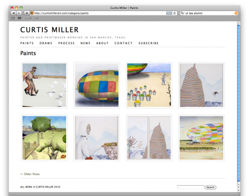
Sites like my friend Curtis Miller’s (I built this site for him last year) are much easier, because the content is clear: the paintings and drawings and prints. The goal is getting eyeballs on them.
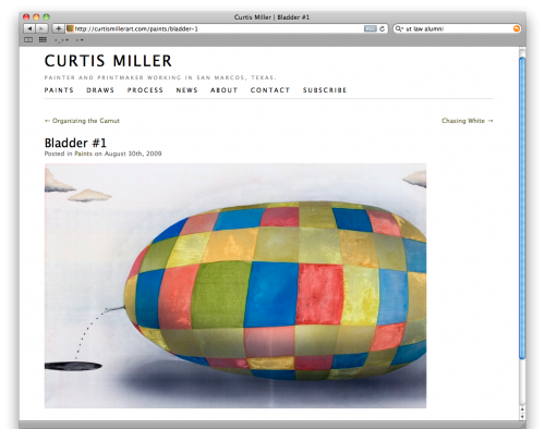
Curt’s work is big, intricate, and colorful, so I didn’t want to bother fussing with the web design too much — all we needed was to get images of Curt’s work online with as little distraction as possible. Too often artist websites feature fancy Flash slideshows (which makes them unusable on iPhones), no descriptive text (so Google has no way to index the pages), no permalinks so that people can link to their favorite work, and worst of all, no RSS feed so fans can keep up with their new work and upcoming events.
All that is solved here by using WordPress. I built off of the Starkers theme and the 960 grid system to make a site for Curt that felt more like a traditional artist portfolio, but offered all the goodies and functionality of a blog.
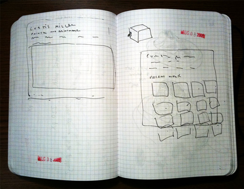
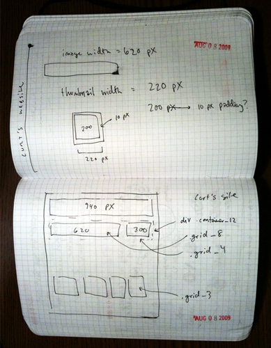
For me, web design is more math than art: the content is X, and I solve the problem around that variable. I start with some kind of constraint, make a couple of calculations, set up a grid, and doodle in my sketchbook:


Once I have the sketches, I start on the code. And tweak and tweak until it’s done.
And once it’s done, I hand it over. I give it to Curt and it’s up to him what he wants to do with it. As pretty as the site might be at the handoff, it’s at the mercy of whatever content he chooses to put up there.
Since I think of myself first and foremost as a writer, this ultimately ends up as an unsatisfying transaction for me. It’s like if you wrote someone a story, but only handed them the outline and the first paragraph. The story isn’t finished. It’s just begun. Where does it go?
How does the site evolve? Who uses it?
I don’t know. I just built the damned thing.
Lots of people say web design is like architecture (I personally like to think of it as cartography), so if it fails, it fails for all the reasons that architecture does: the architect designs for the grand opening, for the ribbon cutting. The people ooh and ah over the shiny new materials, the architect shakes hands, and collects his check. How the building settles over the years, how the inhabitants use the space as their needs change…what does he care? He’s on to the next project.
The ultimate scenario would be if each building had a builder and a keeper, and the builder and the keeper were the same person.
Like my dad’s barn: he built it so that he could use it. He is the builder and the keeper. When he needs the building to do something else, he adds on to it. When he needed a place to store his hay, he built a hay mow. When he needed a place to hang out, he built a tack room.
Which is why I love this website so much. I built it four or five years ago. When I need a page for my new book, I build one. If I need a storefront, I build one.
I am the builder and the keeper.


Nice blog, son. It’s interesting that you mentioned the barn. The “keeper” has started building again to finish that tack room. Every time I’m out there, I think about making it more like a “man room”. Sara reminds me it is a tack room so I will have to find space for the saddles, horse equipment, etc. At least I have my refrigerator! Sara checked things out last night and said the frig was “well stocked”. It may be a little less stocked by later tonight :)
Thanks, Dad! Can’t wait to see the new batch of changes — and help you un-stock the fridge.
Hey Austin
Wonderful article, I couldn’t agree on the purpose of webdesign: Serve the content as good as possible. I even start my themes with Starkers and 960 like you. Are we brothers?
Dad, are you my real dad? haha;-)
In fact I just ordered your book as a present for my girlfriends birthday. I’m sure she’ll like it!
Thanks, Oliver! :)