Be patient with me: I have the feeling the next week or so is going to be filled with a lot of posts about my newfound obsession with Otto Neurath and his ISOTYPE system of pictograms.
Poking around Google scholar and JSTOR, I came across an article on ISOTYPE by graphic designer Ellen Lupton called “Reading Isotype.” (There are no coincidences: I just happen to be reading her book on typography.)
In “Reading Isotype,” Lupton points out that Neurath suggested “two central rules for generating the vocabulary of international pictures: reduction, for determining the style of individual signs; and consistency, for giving a group of signs the appearance of a coherent system. These rules…reinforce the “language quality” of picture signs, making individual signs look more like letters, and groups of signs look more like complete, self-sufficient languages.”
The rules could just as easily be adapted to comics! Tonight, we’ll focus on reduction:
Reduction means finding the simplest expression of an object….
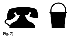
The silouette is a central technique of reduction (figure 7). Silhouette drawing is a kind of pre-chemical photography that emulates the shadow, which is an indexical image made without human intervention, a natural cast rather than a cultural interpretation. International pictures suggest a rationalized theater of shadows, in which signs are necessary geometric formulae cast by material things—Plato’s cave renovated into an empiricist laboratory….The sign as geometric shadow of reality is both a rhetorical connotation and a practical technique for many symbol designers. Martin Krampen suggested “simplified realism;” he urged designers to “start from silhouette photographs of objects…and then by subtraction…obtain silouette pictographs.”
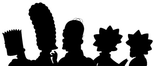
This reminded me of Matt Groening’s claim that the secret of designing cartoon characters is to make a character immediately recognizable in silhouette.
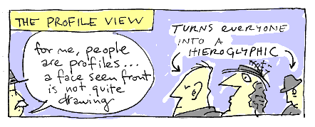
And Saul Steinberg’s obsession with the profile view:
The designer Nigel Holmes points out in his book, Designing Pictorial Symbols, that this graphical reduction does not equal emotional reduction:
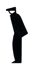
[Let] no one think that the stylized figures that appear in pictographs are cold and devoid of human characteristics and emotion. Look at this figure of a worker. He is unemployed. Not only is there no doubt about that, but the man’s very sadness comes through the simple drawing. He is shivering. He is looking back, rather than to the future. So much can be conveyed by so few shapes.
Figures such as this can too easily be dismissed as “stick-men,” “pin-men,” or “robot people,” but in fact, they evoke a whole host of emotions that belie their simple execution. And that perhaps is the point: to evoke rather than describe. The mere slop of the shoulders (as in this example) or the thrust of a pair of jauntily marching legs can convey a range of feelings…one doesn’t need a photograph…to bring them out.”
Back to Lupton: she switches gears and begins to talk about perspective:
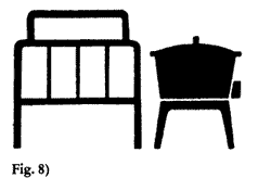
Flatness suggests a factual honesty, as opposed to the illusionism of perspective drawing. Isotype characters pull the shape of an object onto the ideal flat plane of a draftsman’s drawing: They are blueprints of language (figure 8)….
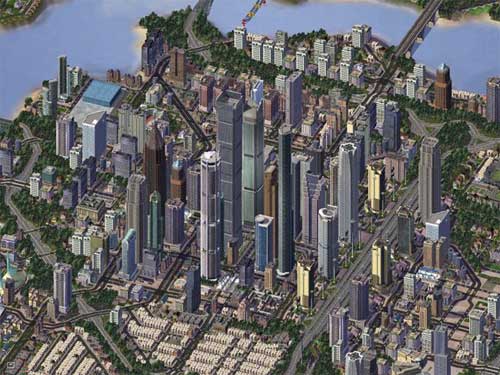
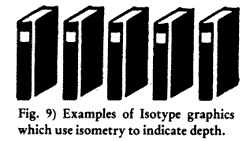
When depth is expressed in Isotype graphics, isometry is used instead of linear perspective. In isometric drawing, parellel lines do not converge; dimension is fixed from foreground to background (figure 9). Isotype rationalizes the retinal by translating distorted sense material into a logical scheme. An isometric drawing describes what we “know” to be true, based on observation. Neurath was impressed by children’s drawings, believing them to express naive, natural, and thus universal perception. Children, he wrote, do not use perspective. They are able to draw an object from all sides at once, and represent an entire forest with a single tree: “Isotype is an elaborate application of the main features of these drawings.”
The isometric drawing that we’re probably the most familiar with is the artwork for the Sim City games:
But it’s the child-like lack of perspective Neurath refers to that captures my imagination. One can imagine adapting an Isotype drawing like this to a comic world:
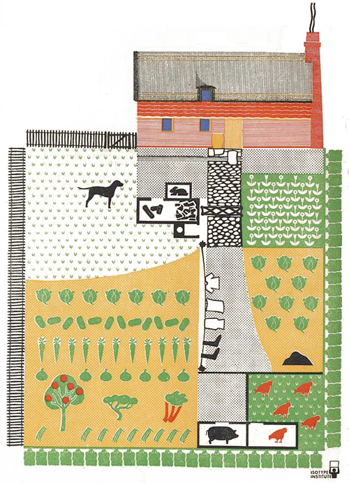
Does anyone else find this stuff fascinating?
Yes, this is a gold mine. A few connections come to mind:
-Otto Soglow & the Little King. They’re almost always in profile. Cookie-cutter puffy-chested soldiers and butlers. All the ladies have pointy legs.
-This stuff is pretty ancient, too, right? Seems like most (all?) languages came from pictograms for bushel of wheat, ox, house, man, water, or whatever. I’m pretty sure Hebrew & Chinese have those kinds of roots, and to my eyes they both have a more “coherent system” (visually) than our alphabet. Really cool how words & pictures keep circling back on themselves.
-Software icons… at best they’re simplified and easily distinguished. I usually don’t need them to be 3-dimensional with gradients and drop shadows…
-I can imagine a story built from pictographic scraps or maybe a sort of stock library you build over time. Constraint + collage. Woop-de-woop!
-The last image reminds me of a map in an American visual history book I’ve got: http://www.loc.gov/exhibits/treasures/images/at0025.2s.jpg Perspectives are totally screwed up and it doesn’t matter in the least.
More, please. Thank you.
Wow, Mark! What wonderful connections!
1) Yes, yes, yes on Otto Soglow. Anyone who wants to go back and have a look at THE LITTLE KING should go here.
2) I found a couple of really good symbol books at the library that I’m going to share at some point.
3) I agree about the software icons.
4) This is the really interesting idea that you mentioned before I could: building a library of images that you collage together to make stories. Steinberg called it “rubber stamp” art. We might call it “cut + paste.”
5) That image is GREAT! I think I’m eventually going to have to start looking into folk art…
I’m fascinated. Thanks for the link to that article in JSTOR. I’m gonna have to read that.
I’m posting a quote from my buddy Adam here:
Read Adam’s post about “A Short History of the Shadow.”
Wow. Fascinating discussion. Not sure I have anything of worth to add other than Mark Beyer and Marjane Satrapi come to mind as examples of comics creators using isotype drawings.
The map Mark mentioned:
Nicely done, sir. I’ve been surprised by the reaction I’ve gotten from my own cartoon silhouette experiment. It couldn’t be any more true. Groening is right—-the Simpsons especially meet the standards…and are designs based from common shapes.
Gert Arntz draws the “unemployed” symbol Nigel Holmes mentions:
David Hockney on perspective and looking from the movie A Day on the Grand Canal with the Emperor of China or: Surface Is Illusion But So Is Depth
From SpongeBob Drawing Tutorials – Silhouette (via @drawn)