A little exercise in information design/gallery hanging today:
What’s the best way to let total strangers know what it is that you do? If you’re a multi-disciplinary artist, how do you express the range of your work? How can a portfolio page engage a viewer/newcomer as well as a piece of art?
I like the blog format because I never feel limited by what I can post…but I do think that it can get fairly daunting sifting through a lot of the material that’s up here. And as an advertising device to grad schools it’s probably ludicrous. (Although I have had people say, “I’m having fun making my way through your site…”)
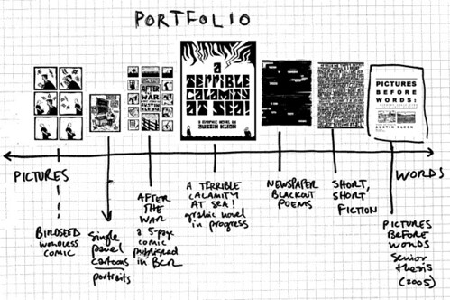
Right now, I’m working on a new portfolio page that’s a little more organized/intuitive than going down the sidebar and clicking on textual links. I’m trying to make it fun, graphical, and easy to use. This is a sketch of what I want it to look like.
This idea was a little inspired by McCloud’s pyramid chart of cartoonists in UNDERSTANDING COMICS (pages 52-53). I’m too lazy to scan it right now, but to way over-simplify it, the x-y axis of the pyramid showed the movement from realistic depiction of objects all the way to the abstraction of language.
Because I find myself constantly oscillating between pictures and words, I figured that might be the best way to show the range of what I do:
PICTURES <---------------|-----------------> WORDS
Comics are right in the middle.
