Steal Like An Artist: The Book

BLOG ARCHIVES

Posts Tagged ‘INFORMATION DESIGN’


ALLOCATION OF TIME

Sunday, October 26th, 2008

Allocation of Time

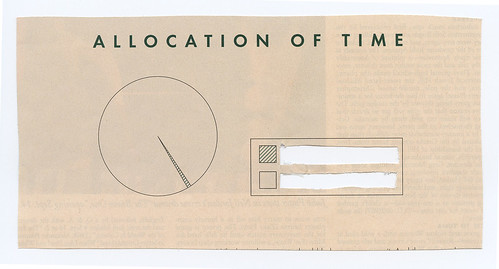
Once a year, before I recycle all my old New Yorkers, I go through them with an x-acto blade. I clipped this little pie chart out of an advertisement, and cut out the labels.

It feels to me like a gag cartoon that needs finished. (A la Indexed.)

Fill in the blanks in the comments.

THE LITTLE MAN

Friday, September 19th, 2008

The Little Man: The San Francisco Chronicle’s Rating System

Yesterday I read this little paragraph in Roger Ebert’s response to claims that he gives out too many stars:

The only rating system that makes any sense is the Little Man of the San Franciscio Chronicle, who is seen (1) jumping out of his seat and applauding wildly; (2) sitting up happily and applauding; (3) sitting attentively; (4) asleep in his seat; or (5) gone from his seat….The blessing of the Little Man system is that it offers a true middle position, like three on a five-star scale.

So I did a little research. The Little Man was the creation of Chronicle artist Warren Goodrich in the early 40s:

On the occasion of the Little Man’s 50th birthday, Goodrich recalled it was just another assignment that he dashed off quickly, noting, “I’m surprised (it) continued.”…Goodrich, who died last year, once recalled that a woman (possibly a disgruntled actress) once hit him on the head with her umbrella and said, “I hate the Little Man!”

The woman isn’t alone. Many of the writers at the Chronicle hate The Little Man. They boo-hoo that the picture already tells the story!

The beloved icon of this newspaper’s entertainment sections is, in fact, a complete nuisance to criticism….That’s because the Little Man gives you a visual clue to what you’re about to read.

And they complain about what Ebert loves: the middle man on the scale—the man with ambiguous feelings.

[T]he message is often unclear…when he’s merely sitting in his chair, watching. Not clapping. Not jumping out of his seat and clapping. Not slumped in his seat. Not out of his seat. Just sitting there.

I suppose a comment could be made here about how people can’t handle ambiguity in their lives: they want things to be black and white, with no shades of grey. As Ebert quotes Siskel,

“What’s the first thing people ask you? Should I see this movie? They don’t want a speech on the director’s career. Thumbs up–yes. Thumbs down–no.”

In fact, the editorial staff was so bothered by the neutral middle man that they had him redesigned:

Few are aware that the L.M. was retrofitted about 10 years ago with a more benign expression. The Little Man pose in between the politely applauding and the snoozing Little Man was redesigned in a microscopic makeover: the “alert viewer” Little Man’s expressionless mouth was tweaked with a slight upturned curve, to indicate a hint of a Mona Lisa smile, suggesting a vague amusement. His raised eyebrows indicate interest but not quite approval, denoting mixed feelings. After artistic spinal fusion, he also sat up more alertly, signifying a mixed review.

All of this came after Talmudic editorial discussions about the meaning of the enigmatic No. 3 Little Man: Did his indecipherable gaze indicate intrigue or ennui? Polite diffidence or glazed-eyed apathy? As a Datebook editor noted, “He’s the middle child, and the most unmanageable.”

the little man

I say: 3 on a 1 out of 5 scale should be ambiguous and neutral. Instead, he’s upright as if he’s engaged and smiling, as if he’s liking it. His back should be against the chair:

the little man redesign

And to be totally ambiguous, his mouth should be a straight line (or no line at all), with no eyebrows. A blank face:

the little man

An ambiguous visual calls for explanatory text! And so, the neutral man is a friend to the good critic: if the visual is ambiguous, then the reader should be more tempted to investigate the article text to get the writer’s take!

the little man - the new lineup

Note: this was a repost from my tumblelog. Apologies for doubling up.

WHAT IT TAKES TO BE AN INFORMATION DESIGNER

Friday, August 24th, 2007

This is a “self-portrait” by Nigel Holmes from Steven Heller’s book, Nigel Holmes on Information Design, that came to me by way of Mark Larson by way of Michael Surtees:

WHAT IT TAKES TO BE AN INFORMATION DESIGNER: A SELF-PORTRAIT by Nigel Holmes

My chart might look like this:

  • 25% easy access to both sides of the brain
  • 25% drawing and writing treated as equals
  • 15% curiosity
  • 10% computer skills
  • 25% sense of humor
  • 25% curiosity about the world

I changed my list. That sense of humor is important — as is curiosity.

MAGIC COINS AND TUFTE

Tuesday, August 21st, 2007

magic.jpg

[Teller's] definition of magic: “The theatrical linking of a cause with an effect that has no basis in physical reality, but that — in our hearts — ought to.”

The Science Times ran a great article on magic, perception and consciousness today, and with it came this cool photo set of Teller demonstrating a coin trick. It reminded me of the wonderful third chapter in Edward Tufte’s Visual Explanations — co-written with professional magician Jamy Ian Swiss — “Explaining Magic: Pictorial Instuctions and Disinformation Design,” that examines illustrations like this:

coins.jpg

Page 60:

In a difficult manipulation, the magician’s hands quickly exchange a silver coin for a copper one. Timing is crucial in magic, and the complex and rapid performance required for deft conjuring is not easy to illustrate. For this sleight, the author notes that the swift moves “must be done in a one-two-three up and down wave of your hand.” Depicting the action at a rate of two frames per beat, the multiple images flow over time and through space, just as a statistical graph records a time-series… Heavy arrows conduct the rhythm of images, while streamers in frames 382 and 384 indicate finer movements of fingers and coins. In this trick, like many others, small maneuvers of fingers are masked by larger hand movements. To expose the method, these drawings depict the hand tipped at varying angles toward the reader. Yet a slightly different angle of adjustment will assure that the audience sees only a silver coin magically transformed into a copper coin. Magicians are preoccupied with such viewing angles, which make the difference between a successful deception and a disastrous exposure. And so for illustrators: Are readers to see the produced effect or how to produce the effect, or both, and by means of what angles?

Speaking of Tufte, I was trolling one of my favorite sites, Peter Durand’s Center for Graphic Facilitation, and came across his notes from one of Tufte’s seminars:

Regular blog readers know how fond I am of mind-mapping Tufte: see Beautiful Evidence, Envisioning Information, and my thoughts on the relationship between comics and information design.

UH, DO YOU WORK HERE?

Friday, July 13th, 2007

As my days as a librarian wind down, I might do a few posts here and there about my thoughts on the profession, and what I’ve learned from the job.

LESSON #1: People don’t read signs.

We have a huge sign over our desks that says, “INFORMATION.” I wear a name tag around my neck that says “STAFF.” Our staff computers are clearly separate from the patron computers. So why is it that at least a handful of times during the week I’m asked, “Uh, do you work here?”

Though people often ignore signs, we can still try our best to make signs better. Above you’ll see a noble attempt by our graphics department. At left, the old sign. At right, the new.

This might be filed under “instructions at the point of need.”

MEGAN JAEGERMAN’S INFOGRAPHICS

Thursday, June 28th, 2007

Edward Tufte points out the great infographics work of Megan Jaegerman, some of whose work is featured in Beautiful Evidence.

Megan Jaegerman produced some of the best news graphics ever done while working at The New York Times from 1990 to 1998….To create this display, [she] did both the research and the design, breaking their common alienation. This design amplifies the content, because the designer created the content.

When I visited an information design studio during a school visit to Carnegie Mellon, the professor asked me for my input on some of the student projects, many of which were infographics like this. I kept blathering on about how much they could be considered comics. I said one girl’s work was basically a hieroglyphic, and one guy’s work was like a Family Circus neighborhood map (I’m not sure he took that as a compliment).

I Googled Megan Jaegerman and couldn’t find anything else out about her. Anyone have any leads?

KEVIN HUIZENGA ON DIAGRAMMING

Wednesday, April 25th, 2007

adam_1.jpg

There was this job I had where I was working at a place called XPLANE, which was an illustration company that did these visual explanation things, and a lot of times that amounted to these diagrammatic/comics illustrations. That really got me interested in diagrams. And after thinking for a while about diagrams, the stories that I did while I worked there have a lot of diagrams in them, and that carried on through. I started collecting old science textbooks and so forth that had these nice illustrated diagrams. It made me realize that since I was in high school and Understanding Comics came out, I’ve always thought about the comics form. And something I started realizing recently is that we talk about comics being a mixture of image and text, but it really seems to me that a part of the way comics works is in this sort of diagrammatic space. You have a pictorial space, which follows certain pictorial norms, and then you have the text part of comics, which follows the syntactical structure of text and language. What comics does is it has this particular way of diagramming those things together using the panel unit and the word balloon as symbols for certain things. I really realized that that was the part of comics that appealed to me the most. When I look at other cartoonists, I think that they’re real pictorial cartoonists. They’re really interested in the image part of comics. And there are other cartoonists who are really interested in stories and the subjects we associate with literary storytelling like character, plot and so on. I realized the thing that interested me in comics is the way all of that stuff is diagrammed on the page and the way that you read it.”

- Kevin Huizenga, interview

Links:

HOW-TO

Friday, February 23rd, 2007

finger.jpg

This comic is by Ellen Forney. It’s part of her excellent collection, I Love Led Zeppelin, which you should read.

At the moment I’m really interested in comics’ potential for integrating fictional and non-fictional elements into one narrative. For example, if you were writing a short story about a hand surgeon, it’s hard to imagine reading paragraphs about the intricacies and fine points of reattaching digits without falling asleep. But with comics, it seems totally reasonable that something like the above might be part of a larger story, seemlessly integrated, and really engaging. (I should note that this is a standalone page, and NOT part of a larger narrative. But if COULD be.)

More on this later, maybe. In the meantime, check out Ellen’s blog.

OUR SAD INABILITY TO COMMUNICATE MIND TO MIND

Monday, January 29th, 2007

mccloudbrain.gif

Didn’t realize I was plagarizing Scott McCloud with the brain-to-brain image in the bottom right of my previous comics/information design mind map. Guess it’s one of those things that drills itself into your subconcious…

onebrain.gif

COMICS & INFORMATION DESIGN, PT. 3: BUT IS IT ART?

Friday, January 26th, 2007

Something to consider:

from James Kochalka, "The Horrible Truth about Comics"

“What is art not? Well, as I’ve described it, Art is not about communication. Art is not a way of conveying information. It’s a way of understanding information. That is, creating a work of art is a means we have of making sense of the world, focusing to make it clearer, not a way of communicating some understanding of the world that we already hold. If you already hold a clear understanding of whatever then there’s no reason to create the work of art. So you don’t. In fact, you can’t. If you are trying to demonstrate some fact pictorially this is called illustration. Illustration is superficial, no matter how skilled, because it is secondary. The idea comes first and the illustration explicates it.”

- James Kochalka, “The Horrible Truth About Comics,” in THE CUTE MANIFESTO