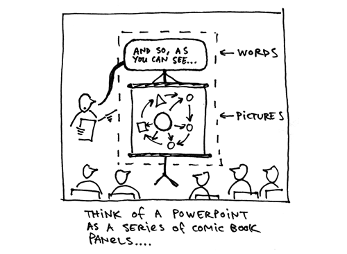
Powerpoint (or Keynote) slide software solves the problem of presenting an audience with a narrative that demands both verbal and visual elements. A slide presentation succeeds when the visual display works with the verbal communication of the speaker to create a narrative in the audience’s mind. The juxtaposition of pictures and words conjure connections and meaning that pictures or words alone could not.
Some of the best uses of Powerpoint come from the masters of verbal/visual, picture/word communication: cartoonists.
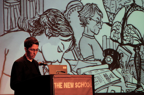
On her tour for Fun Home, Alison Bechdel projected panels from the graphic novel as she read the narration aloud:
Scott McCloud uses an epic slideshow to take his audience through his theory of comics:
Chris Ware and radio host Ira Glass have collaborated on “Lost Buildings“—basically a radio story accompanied by a slideshow:
My advice to all who want to use slide software for stronger presentations: read some good comics. Pay attention to pacing, sequence, and the way cartoonists weave verbal and visual elements to tell a story.
Trash the templates, abandon the bullet points, and find the right combination of pictures (your slides) and words (your voice) to communicate your narrative.
Any other cartoonists I’m missing here? What are the best slide presentations you’ve witnessed?
Links:
- Understanding PowerPoint: Q&A with Scott McCloud
Extremely intelligent discussion of Powerpoint in terms of visual language and comics - More posts on Powerpoint


BONUS INSPIRATION (NSFW): The brilliant, irreverant, and filthy video game reviews of Ben Croshaw (aka Yahtzee) are basically the funniest Powerpoint presentations you’ve ever seen, and a perfect example of what I’m talking about. Here’s a recent one:
MORE INSPIRATION (suggested by my wife):
music video (by DA Pennebaker) for Bob Dylan’s SUBTERRANEAN HOMESICK BLUES (from the film, DON’T LOOK BACK):
No discussion of powerpoint is complete without a mention of Lawrence Lessig, a law professor famous for his presentation style:
http://www.google.com/search?q=lessig+style
Good stuff, Austin. Probably I’ll blog about this later myself. For now, this thought: the besetting vice of most PowerPoint presenters – certainly in academia and CERTAINLY in the business world – is that they they of the tool as a device for TEXTUAL manipulation.
In a way, this is understandable, since MSFT has embedded a lot of text-manipulation tools into the app. It’s easy to cut-&-past; text re-sizes automatically to fit available space; the spell-checker works as in Word; and so on. So it *acts* like a word processor in key ways.
But, of course, *using* it like a word processor is bass-ackwards when the purpose is to PRESENT information to a group of people. You have the opportunity to show people compelling pictures – or even a blank screen, if that’s what will get their attention. You can harmonize the pictures with the words, exactly as you’ve suggested with the excerpts here.
The problem remains, though, that most people don’t stimulate their imaginations this way. Most people don’t think “What story will I tell this audience?” and then shape their presentation to move that story along.
But they should.
You hit some great ones here — what’s interesting is that we’re using Powerpoint similarly, but for very different goals. We’re looking to teach kids how to write and to teach kids how to make some comics in the context of World of Warcraft (cuz, duh, we study games). I argue that Powerpoint is one of the easier ways for a kid to begin to combine words and images — we’ve been using it as an instructional tool with some success so far.
Jonathan: You, know I have to admit, I’d never watched a Lessig presentation. Those with me can watch one here: http://randomfoo.net/oscon/2002/lessig/free.html
Hafta research him further.
Tim: You nailed it.
Sean: That’s really cool — that you’re teaching them to COMBINE pictures and words.
Three awesome comments!
I do a number of presentations for my job (librarian) and I’ve recently taken to drawing all my slides and using the “slideshow” feature of the OS to display them. I’m still figuring out how to best do this from a stylistic point of view, but I have to say, it gets great reviews from the audience. Even not really refined art looks good to a lot of people and it’s a breathe of fresh air in compared to endless bullet points.
Derik: That’s really smart. I think another good practice is just making a PDF of your presentation and make it “full screen” — then you already have a PDF you can post online if people want the notes.
I like good PowerPoint when it is a dance. A mix of rhythm, visuals and motion that tells a story. Bullets are for guns… which can kill people. I agree with Tim. Ask what is the story? Ask what do you want to accomplish? What action? What feeling? And if you find you are shrinking the font… for gods sake stop, pass out a handout or post those details on the web for later scrutiny.
There are tons of ways to make a presentation interactive, engaging. Ask questions. Leave blanks. Surprise them. Control the timing. Or kill them one slide at a time.
Those are some great videos. Kinda related, I read a good line in Dan Roam’s book this morning:
“Showing…happens at the end of the visual thinking process, not the beginning. Business-people who try to start the process with the showing—which is what happens 90% of the time—get so distracted by drawing skills, computer programs, and visual polish that they miss the real value of this step. Showing is not only our chance to wrap up our ideas so that we can share them with everybody else, this step is also when we invariably make our biggest breakthroughs—but only if we’ve already looked, seen, and imagined well.”
[http://www.thebackofthenapkin.com, p.129]
I don’t mean this to sound flip, but I think cartoonists are just used to *thinking it through* before they get to the presentation stage. The rest of us tend to subconsciously equate “making a presentation” with the product (e.g. slides) instead of the process (what’s my point, again?).
Mike: “Bullets are for guns.” That’s a keeper.
Mark: Great quote! I’ve been wanting to read that book…
Mark, I’m reading Roam’s book today. Another quote from his book, which speaks to Derik’s comment above…
“People like seeing other people’s pictures. In most presentation situations, audiences respond better to hand-drawn images (however crudely drawn) than to polished graphics. The spontaneity and roughness of hand-drawn pictures make them less intimidating and more inviting….” (p25)
Two excellent quotes from the same book!
This is fun: Vizthink picked this post as the winning response to their question, “PowerPoint: A powerful tool poorly used or a poor tool overused?”
They said,
So thank YOU, my brilliant readers. Your comments make everything posted here much smarter.