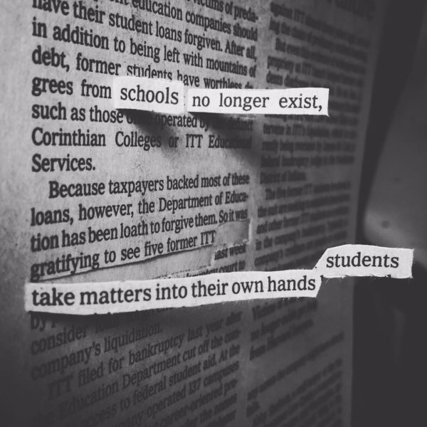
I made this newspaper popout last year, but I was inspired by the photos of this week’s school walkout to post it here again. I hope these kids stay fed up and change the world.

I made this newspaper popout last year, but I was inspired by the photos of this week’s school walkout to post it here again. I hope these kids stay fed up and change the world.
Here’s a little sneak-preview of the slideshow introduction I’m working on for my portion our Visual Note-Taking 101 webinar that’s a week from today! (Register here.)
I got the idea from some sumi-e doodles and quotes I collected a couple years ago, thinking about my formal (and informal) education:

…lately I find myself frequently torn between whether I’m really an artist or a writer. I was trained and educated as the former, encouraged into the world of paint-stained pants and a white-walled studio where wild, messy experiments precipitate the incubation of other visual ideas— though I’m just as happy to sit at a desk in clean trousers with a sharp pencil and work on a single story for four or five days in a quiet and deliberate manner. In short, I’m coming to believe that a cartoonist, unlike the general cliché, is almost—bear with me now—a sort of new species of creator, one who can lean just as easily toward a poetic, painterly, or writerly inclination, but one who thinks and expresses him- or herself primarily in pictures.—Chris Ware, Introduction to The Best American Comics 2007
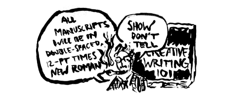
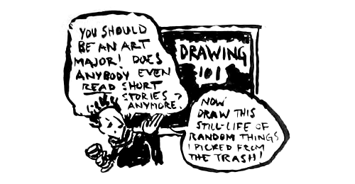
“When you have the talent to be able to write and to draw it seems a shame to choose one. I think it’s better to do both.”
—Marjane Satrapi
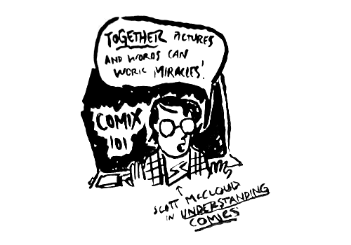
A comics-art curriculum is interdisciplinary. As comics-art students learn to become literate and visually literate, they need to develop a vast array of skills. They need classes in drawing, writing, computer art, literature, storyboard, and character design. They need research skills, so they can make their stories convincing and make their characters behave and look real enough to come alive on the page or screen.—James Sturm, “Comics In The Classroom”
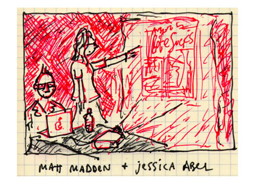
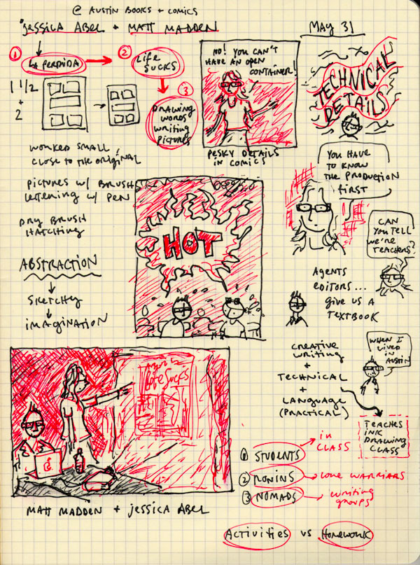
Jessica Abel and Matt Madden were in town this weekend to promote Jessica’s La Perdida and Life Sucks, and their brand-new comics textbook collaboration, Drawing Words and Writing Pictures (great title). Yesterday they talked about the books (in that order) at Austin Books and Comics. There was a small crowd, not much A/C, and a keg of beer!
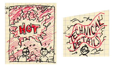
The biggest treat was that we got to buy a copy of the new textbook, which doesn’t officially come out for a week or so:
Some things I took away from their talk:
After she said that, when I was flipping through the book I found this cool example:
The book is formatted so that each type of creator can benefit from the lessons.
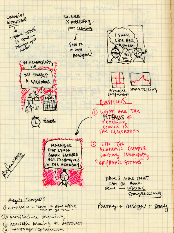
Since both Matt and Jessica are teachers at SVA, I asked them if they saw any pitfalls, teaching comics in the academy. Is there a chance that comics programs could turn out like MFA writing programs, with students turning out uniform, quiet, lit’ry, “workshopped” New Yorker types of short stories?
They both agreed that “it all comes down to the teachers,” and “if comics can’t withstand being taught in the academy, what kind of medium is it?”
I mentioned Lynda Barry’s new book as a great antidote to the “bad” kind of creative writing teaching, and Matt had a great reply:
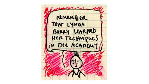
(He was referring to Lynda’s art teacher in college, Marilyn Frasca.)
Overall, I think this book is extremely well done and worth checking out by anyone who’s interested in making comics—it’s probably the first book I’ve ever seen that could actually serve as the lone textbook for a comics-making class. I think it will sell like hotcakes, and, as Jessica and Matt hinted, we’ll definitely see a sequel focusing on “advanced” topics such as coloring and webcomics.
My complete notes from the talk, if anyone’s interested:
Thanks to Matt and Jessica for swinging down to Austin!
A comics page by Joe Lambert
Joe Lambert is a student at the Center for Cartoon Studies. I’ve been following Joe’s blog for a while, partly because he’s a great cartoonist, partly because he does such a great job of documenting his life as a student at the school. (I’ve found student blogs to be a fabulous resource for determining whether a program would be right for me. Dig also, Dan Saffer’s blog about his time at Carnegie Mellon’s Design school)
Joe recently did a long interview with CCS faculty member Steve Bissette. I was impressed by Joe’s knowledge, but also by his honesty:
“I love so many things about comics, but at the same time I get really tired of reading something that I don’t like and getting this nagging feeling in the back of my head telling me that I should like it because it is done well. I think this is part of the complacency we sometimes fall into when creating things: thinking that it’s okay to be passive about what we’re doing or what we’re reading. I don’t want to get into value judgments, because everything is great all of the time, right? But I get tired of liking things just because they’re not bad. I really want to hate everything that isn’t amazing. I don’t think too many comics are doing everything that comics can be doing. “
I also really dig Joe’s list of cartoonists he’s looking to for inspiration these days:
Lately I’ve been looking closely at guys like David B. and Lewis Trondheim. Both create pages that are visually appealing, often with consideration to the way a page reads – the flow, I guess. But they’re both great at symbolizing ideas and doing so in a way that doesn’t interrupt the reading….I like the way Craig Thompson effortlessly guides my eyes across pages. I like the way Chester Brown’s thin, delicate line makes me uncomfortable; or the way Chris Ware evokes the passage of time and establishes rhythm using any number of panels; the way Lilli Carre packs so much into her characters’ expressions; I’m excited by Jordan Crane’s audacity to leap from moment to moment without holding the reader’s hand too tightly. Kevin Huizenga takes his comics very seriously, but still is still playful too.
Yes, yes, yes. Go say hello to Joe.
“Drawing is easier to teach than critical thinking. Don’t get me wrong, rendering well is a tremendous asset for a cartoonist. Still, I think it is often over emphasized. In fact, many of the great cartoonists sublimate their drawing skills and instead favor a style that relies more heavily on graphic design. They distill images until they function more as language or picture-writing.”— James Sturm, journal for Slate.com about running the Center for Cartoon Studies
Here’s what I want: I want a graduate program (MFA, MA, PhD, whatever) that combines a great books program, a creative writing MFA program, a studio art MFA program, a graphic design program, and an information design program, all rolled into one. It’s contents will look something like this:
design courses:
art courses:
writing courses:
reading list:
software training:
If anyone out there knows of such a place, contact me immediately.
Until then, I’ll be tearing my hair out, scouring Google, studying for the GRE, and trying to fit what it is that I want to do into some kind of disciplinary track of study.
If you want to study pictures, there are places for that. If you want to study words, there are places for that, too. If you want to study pictures and words and what happens when you put them together? Good luck.
This site participates in the Amazon Affiliates program, the proceeds of which keep it free for anyone to read.