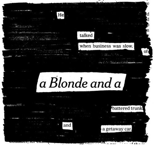
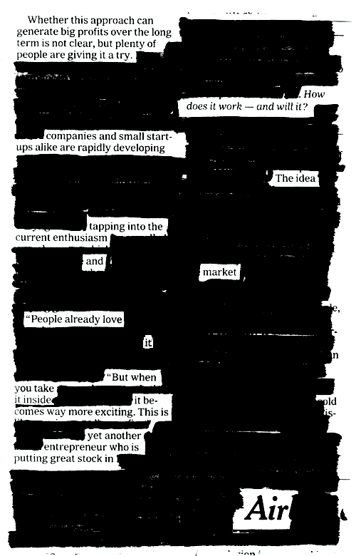
I once saw [Ralph] Steadman at a book-signing: he was getting bored with just signing his name, so he got his cigarette lighter out, set fire to the title page, quickly batted out the flames with his hand, and then the burned edge of the paper into a profile of a drawing.”
– Eddie Campbell in an Inkstuds podcast
MATT MADDEN ON COMICS ALBUM COVERS
Matt Madden makes an excellent point: most album covers featuring comics don’t actually read as comics.
My cover for Hawkline definitely fell short into the “comics-in-the-service-of-design” category. But the fun news is that the CD is going to press soon!
MAGIC COINS AND TUFTE
[Teller’s] definition of magic: “The theatrical linking of a cause with an effect that has no basis in physical reality, but that — in our hearts — ought to.”
The Science Times ran a great article on magic, perception and consciousness today, and with it came this cool photo set of Teller demonstrating a coin trick. It reminded me of the wonderful third chapter in Edward Tufte’s Visual Explanations — co-written with professional magician Jamy Ian Swiss — “Explaining Magic: Pictorial Instuctions and Disinformation Design,” that examines illustrations like this:
Page 60:
In a difficult manipulation, the magician’s hands quickly exchange a silver coin for a copper one. Timing is crucial in magic, and the complex and rapid performance required for deft conjuring is not easy to illustrate. For this sleight, the author notes that the swift moves “must be done in a one-two-three up and down wave of your hand.” Depicting the action at a rate of two frames per beat, the multiple images flow over time and through space, just as a statistical graph records a time-series… Heavy arrows conduct the rhythm of images, while streamers in frames 382 and 384 indicate finer movements of fingers and coins. In this trick, like many others, small maneuvers of fingers are masked by larger hand movements. To expose the method, these drawings depict the hand tipped at varying angles toward the reader. Yet a slightly different angle of adjustment will assure that the audience sees only a silver coin magically transformed into a copper coin. Magicians are preoccupied with such viewing angles, which make the difference between a successful deception and a disastrous exposure. And so for illustrators: Are readers to see the produced effect or how to produce the effect, or both, and by means of what angles?
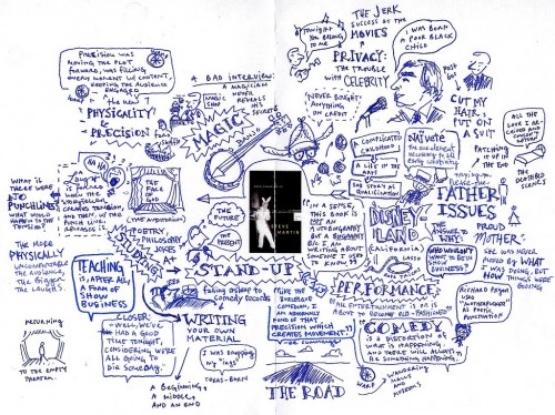
Speaking of Tufte, I was trolling one of my favorite sites, Peter Durand’s Center for Graphic Facilitation, and came across his notes from one of Tufte’s seminars:
Regular blog readers know how fond I am of mind-mapping Tufte: see Beautiful Evidence, Envisioning Information, and my thoughts on the relationship between comics and information design.
“OH GOD, HERE THEY COME — ACT GREEN”
Meg and I almost died laughing when we saw this one:
My buddy Tim just posted about the cartoon genius that is Bruce Eric Kaplan.
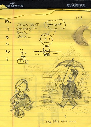
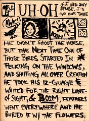
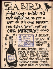
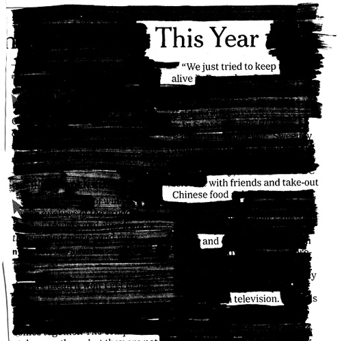
TEXAS BLACKOUT SUITE, PT. 2
I can’t seem to finish one of these things, so for now, I’ll just keep stringing together these little haiku cop outs.
We’re having a great weekend: I hope you are too.
- ← Newer posts
- 1
- …
- 515
- 516
- 517
- 518
- 519
- …
- 618
- Older posts→