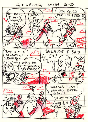
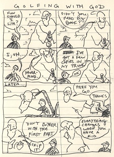
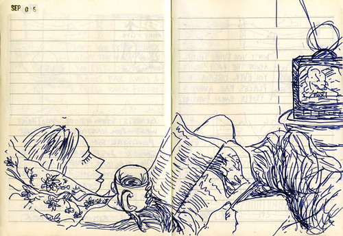
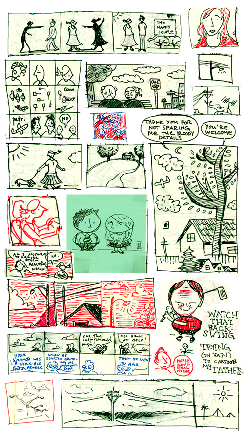
Why post only the good stuff? Why not post the crappy little doodles that make up the majority of a sketchbook?
WELCOME TO THE WORKING WEEK
Today I started my new job (!!!) as Electronic Publishing Specialist for UT’s Law school. (That’s a fancy title for web designer.) It’s a great gig, everybody in the department is awesome, and I’m genuinely excited about it. I’ll be doing most of my work under the webmaster, a guy named Adam Norwood. Adam is a really talented designer, artist, and great guy, and his site is worth checking out. He’s a lot better at the technical web stuff than I am, so I think I’ll be able to learn a lot from him.
The only bummer today was sitting through UT’s 4 hour orientation session. Like I told my new bosses, it was “15 minutes of readin’, 4 hours of sittin’.” Luckily, they provided free stationary stationery:
It feels so good to have a job…
BETSY 2 LIVES!!
My car is sitting in a tow yard in south Austin. The side of the driver’s window is messed up from the break-in, the ignition has been torn out, and the windshield looks like somebody threw a bottle at it. The thieves ate our Chex-Mix, took our Ipod adapter, but left our cowboy hats, umbrellas, and flip-flops. They took it for a 100-mile joyride (I know, because I had just got gas, and flipped the odometer) and dumped it in a parking lot.
Tommy-the-Tow-Guy and I, we put in the clutch, stuck a screwdriver in the ignition, and she fired up like nothing happened. It’s totally drivable, but we have to get the insurance company out to assess the damage before we can drive off with it and get it repaired.
So add this to the news that as of tomorrow, I will probably be employed, Meg and I are very happy. Here’s what I doodled last night, thinking I’d never see her again:
Even taking into account the car theft, we’re having a really fabulous time in Austin. Here’s the sunset over Lake Travis that we got to see last night:
Can’t beat that.
PROCESS: MY COVER FOR HAWKLINE’S UPCOMING EP, “SHIPWRECK”
I usually don’t talk much about my individual process here, mostly because I’m not sure who’d be interested, but today I thought I’d break with precedent and take you step-by-step through a recent project I did for my buddies in the band Hawkline.
Long story short, they saw my work on Calamity, said they were putting out an album called “Shipwreck,” and that my stuff might be a good match. So I said, “Cool. Let’s do it.”
I tend to look at everything through the medium of collage: all we’re really doing with art is taking things that we’ve seen and making something we can call our own. Borrowing. Stealing. Mixing. We take the words we know and put them into sentences. We take the notes we know and put them into melodies. We take the experiences we have and shape them into stories.
Etc.
I’d say that 90 percent of my process is fumbling around in a sketchbook, 10 percent is execution. In this case, they caught me in a brush phase, so I came up with this concept:
What did Picasso say? “Good artists borrow, great artists steal?” Well, I ripped that cover idea off of an old engraving I came across:
Anyways, the band liked the idea, but decided they wanted to put out an EP before the album. I thought I could do a lot better than the original design, so I started looking for inspiration. I remembered R. Crumb’s cover for Big Brother and the Holding Company’s Cheap Thrills:
Funny story about that cover: originally it was supposed to be the back cover for the album, but Janis liked it so much she had it put on the front. But anyways, I liked the way the artwork was splintered into comic panels, so I said, “Okay, sure — I’ll rip that off with woodcuts.” I began doodling on post-its for a layout:
At this point, I thought I had a good idea of where the cover was going, so before making a bunch of artwork, I decided to finish their logo first. A couple of months back I had already doodled some logos while staying at Corey’s house. Hawkline’s sound is pretty muscular, so I wanted something stark and simple. (Something that would look good on a sticker or a tattoo.)
There just happened to be a Ketel One Vodka ad staring up at me from the back cover of a Rolling Stone:
Now, the font that Ketel uses is just a font called Bradley, that all kinds of places use:
So I ripped that off:
And came up with a final version. Keep in mind, I’m hand-lettering this:
I liked that a lot, so I thought I’d just do the title of the EP in the same font as a kind of anchor for the cover. I also played around with layouts, drawing a bazillion thumbnails:
Now that I had the layout pretty much figured out, I concentrated on the final artwork. I found these cool woodcuts by an artist named Kim Atkinson:
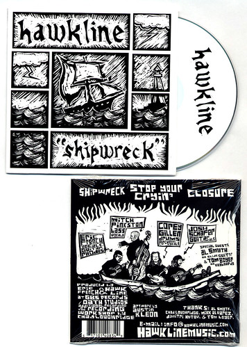
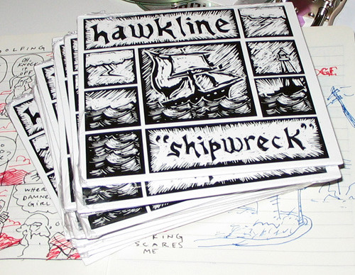
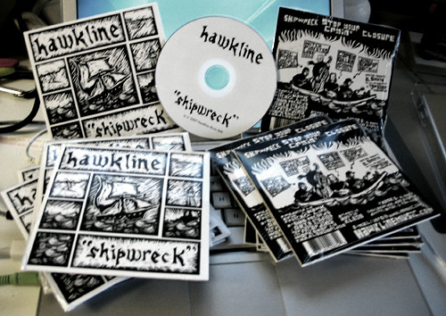
With those as inspiration, I finished the front cover:
Now to the back. The band members said they’d be interested in having me cartoon them, so I had them send me some mugshots:
Which I used to doodle caricatures:
I thought the idea of a band playing in a lifeboat was a fun one, so I used that and hand-lettered the information they wanted listed for the back cover:
I have to admit, I almost like the back cover more than the front. Since the cover and the back were so busy, I thought a simple CD design was the way to go:
So there you have it. Hope that wasn’t too terribly boring. Check out Hawkline. The guys have my favorite song, “Stop Your Cryin’,” [MP3] streaming on on their myspace.
ROADTRIP SKETCHBOOK
- ← Newer posts
- 1
- …
- 44
- 45
- 46
- 47
- 48
- …
- 70
- Older posts→