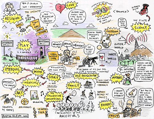
I just finished reading Carl Jung’s Memories, Dreams, Reflections.
In the spring of 1957, when he was eighty-one years old, C. G. Jung undertook the telling of his life story. At regular intervals he had conversations with his colleague and friend, Aniela Jaffe, and collaborated with her in the preparation of the text based on these talks. On occasion, he was moved to write entire chapters of the book in his own hand, and he continued to work on the final stages of the manuscript until shortly before his death on June 6, 1961.
A good bit of this book blew my mind, but especially this part:
I feel very strongly that I am under the influence of things or questions which were left incomplete and unanswered by my parents and grandparents and more distant ancestors.
[…]
Our souls as well as our bodies are composed of individual elements which were all already present in the ranks of our ancestors. The “newness” in the individual psyche is an endlessly varied recombination of age-old components.
[…]
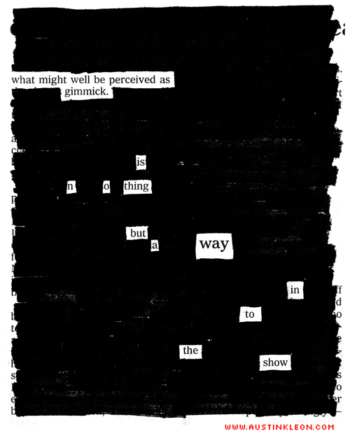
I answer for them the questions that their lives once left behind. I care out rough answers as best I can. I have even drawn them on the walls.
[…]
The meaning of my existence is that life has addressed a question to me.
We are a collage—a remix—of our ancestors. We have spiritual DNA, as well as physical, and our lot in life is to answer the questions posed by the people who came before us…