Today’s newsletter is about understanding perfectionism, and how I misunderstood perfectionism for the longest time, so I wasn’t able to detect it in myself.
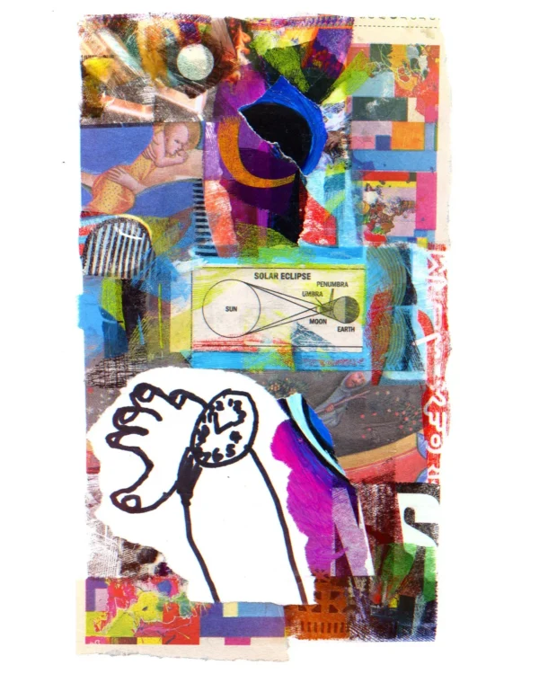
But the letter really began with this image:
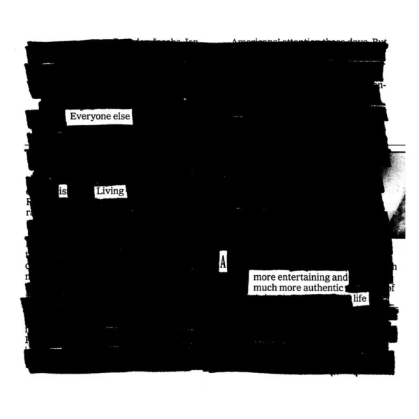
I built this collage around a drawing that my son wadded up in frustration before running out of the studio in tears. In the past, this is what I thought perfectionism was: an inability to deal with the disconnect between what a drawing looked like in your head and how it came out of your hand. I thought perfectionism was a problem for the uptight, for big babies who can’t just loosen up and let ‘er rip.
You can read the rest of the newsletter here.
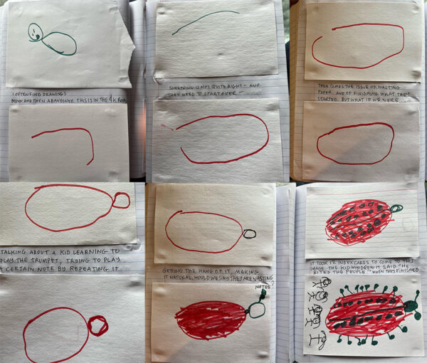
Something I wasn’t able to weave into the newsletter — because it’s not really about perfectionism, it just got me thinking about it — was this instagram post by Lynda Barry about “drawing with four year olds and being there to see how they figure something out”:
I often find drawings begun and then abandoned… Something is not quite right and they need to start over. Then comes the issue of wasting paper. And of finishing what they started. But what if we were…talking about a kind learning to play the trumpet, trying to play a certain note by repeating it… Getting the hang of it, making it natural. Would we say they are wasting notes? It took 12 index cards to come to this image. The kid who drew it said “He bites the people” when they finished.
…I would have been told to stop wasting paper and I may have said the same thing to this kid if I wasn’t really paying attention to how this drawing came about. It reminds me of an archer— there is no wasting of arrows when you’re learning to shoot.
Lynda really got me to internalize this idea with my kids — there was no such thing as wasting paper or markers. We encouraged them to use up as many materials as they had.
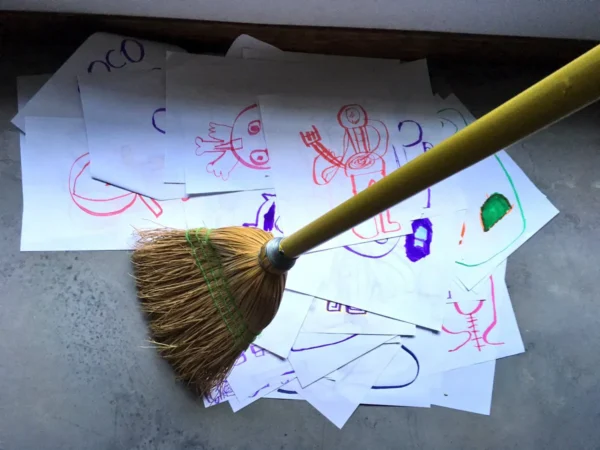
As I mentioned in another letter, there were days that Jules filled so many pages that we’d sweep them up at the end of the day with a broom:
One of the things I’ve been playing with in my head is: What if we treated ourselves with the tenderness (and yes, the discipline) that we show our children?
For years, I wanted to write a book about how much I learned from watching my kids work, but what I’m starting to realize is that what I’ve really learned is how to set up the conditions for creativity to happen. If you can do it for a four-year-old, maybe you can do it for yourself…
And one of the great lessons is: Believe that there is no such thing as waste. Creative work is the residue of time “wasted.” Of materials “wasted.”
At the same time, the whole reason I made the collage is so I could “save” that drawing from the wastebasket! And Lynda, too, in that post, is saving those drawings, repurposing the “waste” into something worth saving…
So maybe one has to make without regard to waste, without fear, and save and share what you can’t stand to see wasted…